Thursday, December 9, 2010

Small Area Income and Poverty Estimates, 2009

New data available in HealthLandscape!

Yesterday, the U.S. Census Bureau released their 2009 Small Area Income and Poverty Estimates. According to their analysis, the poverty rate for children ages 5 to 17 in families rose in 295 counties and declined in 19 counties between 2007 and 2009. Most counties saw no statistically significant change between these years.

The U.S. Census Bureau, with support from other Federal agencies, created the Small Area Income and Poverty Estimates (SAIPE) program to provide more current estimates of selected income and poverty statistics than those from the most recent decennial census.

The U.S. Census Bureau's Small Area Income and Poverty Estimates (SAIPE) program provides annual estimates of income and poverty statistics for all states, counties, and school districts. The main objective of the program is to provide estimates of income and poverty for the administration of federal programs and the allocation of federal funds to local jurisdictions. In addition to these federal programs, there are hundreds of state and local programs that depend on income and poverty estimates for distributing funds and managing programs.

The SAIPE program produces the following county estimates:
• total number of people in poverty
• number of related children ages 5 to 17 in families in poverty
• number of children under age 18 in poverty
• median household income

The estimates are not direct counts from enumerations or administrative records, nor direct estimates from sample surveys. Instead, income and poverty estimates are modeled by combining survey data with population estimates and administrative records. Beginning with the SAIPE program's estimates for 2005, data from the American Community Survey (ACS) are used in the estimation procedure; all prior years used data from the Annual Social and Economic Supplements of the Current Population Survey. Further details are given in a 2007 SAIPE report, Use of ACS Data to Produce SAIPE Model-Based Estimates of Poverty for Counties [PDF 3.4M]. For more information, see Small Area Income & Poverty Estimates.

Figure 1. Percent of Population in Poverty by County, 2009


Figure 2. Percent of Population Under 18 Years of Age in Poverty by County, 2009


Login now to start making maps!


Show the need.

Paint a portrait.

Tell the story.

Wednesday, November 17, 2010

Happy GIS Day!

What a great fall season so far - October brought us World Statistics Day, and November brings us GIS Day. For those of you who aren't well-acquainted with the term, GIS stands for Geographic Information System. GIS brings together technology and data to create a unique way to capture and display information. We use GIS to visualize data in a way that's often more meaningful than simple tables of numbers, where the real story often gets lost in the rows and columns. Displaying the data in geographic context makes it easier to spot patterns, trends, and relationships.

HealthLandscape uses GIS technology to map community data, including health, socio-economic and environmental information. The power behind the HealthLandscape platform is that all of the data are freely available in one central location.

Figure 1. Rate of High Cost Conventional Loans - Cincinnati Region - 2008 (Tract Level)


Figure 2. Ohio Self-Sufficiency Standard 2008: One Adult, One Infant, One Preschooler


Figure 3. County-Level Counts of H1N1 Cases


Other groups and agencies use GIS for in variety of applications, including mapping the ground motion and shaking intensity after an earthquake, the environmental consequences of natural and man-caused disasters, estimated carbon emission patterns, and crime rates. There is even an entire project dedicated to the mapping of historical Census data - GIS For History.

Figure 4. Pacific Northwest Shakemap, U.S. Geological Survey


Figure 5. Guimaras Oil Spill, Philippines, WWF Philippines


Figure 6. Total Emissions of Fossil Fuel Carbon Dioxide, The Vulcan Project


Figure 7. Rutgers Crime Log, Rutgers University


Figure 8. The First Census: America in 1790, GIS For History


For more information on GIS, visit GIS.com.


Show the need.

Paint a portrait.

Tell the story.

Monday, November 15, 2010

Robert Graham Center Unveils Med School Mapper

The American Academy of Family Physicians’ Robert Graham Center for Policy Studies in Family Medicine and Primary Care publicly launched the Med School Mapper project on November 1, 2010, with funding provided by the Josiah Macy, Jr. Foundation.

Amidst American Association of Medical Colleges (AAMC) and Council on Graduate Medical Education (COGME) recommended expansion of medical education, principally through expansion of existing training sites, there is little mention or measurement of how the large investments of public dollars meet the needs of the citizens. In response to this, the Macy Foundation funds the Medical Education Futures Study (MEFS), whose main mission is “to highlight the social mission of medical education during the current period of medical school expansion and potential major health care reform. ” This ranking of schools by social accountability is a novel step in understanding their social impact on a national scale. However, as state policymakers attempt to direct expansion funding in terms of accountability to their own regional, social and health care access needs, they have few tools for understanding the local and regional impact of schools. Neither national rankings nor workforce models can capture the regional impact of training sites.

The Robert Graham Center has been studying means of demonstrating such an impact, using geographic and policy analyses of individual medical schools’ graduates (both allopathic and osteopathic). Using novel approaches to analyzing and displaying regional impact, the Med School Mapper will give planners essential information for directing and evaluating medical school expansion and its impact on access and other social aims. This tool utilizes American Medical Association (AMA) data, and ranks states and their medical schools on various areas of practice and the number and percent of graduates retained in state. The Mapper tracks the graduate footprint from a state, or medical school within that state, to provide a clear visualization of the practice locations of graduates by county, their penetration rates within counties, and information about the types of areas and specialties in which these graduates practice in order to provide data detailing how well a particular state or school meets its mission of social accountability.

Figure 1. State Footprint


Figure 2. School Footprint

Thursday, November 11, 2010

HealthLandscape Version 3.0 - Coming Soon!

The HealthLandscape team is in Washington, DC this week finishing up the development of HealthLandscape Version 3.0. We've been putting in long hours with our friends at Blue Raster and the Robert Graham Center making improvements to the current HealthLandscape. When HealthLandscape V3 is released, users will have access to a number of new tools including quick geocodes, quick maps, drawing tools, improved printing capabilities, and easy data exports, just to name a few.


We're very excited about the new developments. Many more details and final release date coming soon!

Friday, October 29, 2010

Halloween Mapping with HealthLandscape

The US Census Bureau just released their Halloween Special Feature. According to their research, in 2009 there were 36 million potential trick-or-treaters, or children between the ages of 5 and 13. These trick-or-treaters had 111.3 million occupied housing units to canvas for the annual haul of candy.

HealthLandscape can help you with your Halloween planning. If your county has a high number of trick-or-treaters, then you'd better have a few extra bowls of candy standing by.

Figure 1. Number of Children Ages 5 to 13, 2009 (Population Estimates)


Speaking of candy, in 2009 Americans had a per capital candy consumption of 24.3 pounds! Where did it all come from? California has the largest number of confectionary establishments, with 193. Pennsylvania is second, with 143, and New York is third, with 120.

Figure 2. Number of Confectionary Manufacturing Establishments (Chocolate and Non-Chocolate), 2008 (County Business Patterns)


Happy Halloween!

Wednesday, October 20, 2010

World Statistics Day

Happy World Statistics Day!


October 20, 2010 was set aside to celebrate the first World Statistics Day. The goal is to raise awareness of the achievements of official statistics and to recognize the work of statisticians in producing and disseminating the necessary data to respond to the every day new challenges and to measure progress in people’s lives. The celebration of the World Statistics Day will acknowledge the service provided by the global statistical system at national and international level, and help strengthen the awareness and trust of the public in official statistics. It serves as an advocacy tool to further support the work of statisticians across different settings, cultures, and domains.

Over 100 countries around the globe are celebrating with special events, Census data releases, statistical literacy campaigns, and statistical fairs.

Statistics are a part of our every day lives. We use and reference them regularly, sometimes without even realizing it. The US Census Bureau produced a video to illustrate just how common (and important!) statistics are.


They've also released a Special Edition of Facts for Features, featuring some fun facts in honor of the occasion:

There are 14 U.S. principal statistical agencies: the Bureau of Economic Analysis; Bureau of Justice Statistics; Bureau of Labor Statistics; Bureau of Transportation Statistics; U.S. Census Bureau; Economic Research Service; Energy Information Administration; National Agricultural Statistics Service; National Center for Education Statistics; National Center for Health Statistics; Office of Environmental Information; Social Security Administration Office of Research Evaluation and Statistics; National Science Foundation: Science Resources Statistics; and the Internal Revenue Service's Statistics of Income Division. (HealthLandscape includes data from many of these agencies!)

There were 29,208 statisticians employed in the United States in 2009.

In 2008, 20 percent of statisticians are employed by the federal government, with most of them concentrated in the Departments of Commerce, Agriculture, and Health and Human Services. Another 10 percent worked for state and local governments.

(Source: US Census Bureau)


Show the need.

Paint a portrait.

Tell the story.

Wednesday, September 29, 2010

The Data are Coming!

Good news for all of the data-minded readers out there! While we're all anxiously awaiting the release of the Census 2010 data, we can begin to enjoy the first wave of releases from the American Community Survey.

The American Community Survey replaced the traditional long-form questionnaire that was sent to a smaller subset of households through Census 2000. The ACS sample includes about 3 million housing and group quarter units in the US, including representation from every county. The survey asks about professions, earnings, health insurance, modes of transportation, and housing costs. Census 2010 gives us the actual count of the population on April 1, 2010, but it's the ACS that describes how that population lives - the portrait of America. The 2009 ACS 1-Year Estimates are now available in the American Fact Finder for geographic areas with populations of 65,000 or more.

The highlights?

Median Household Income - Real median household income in the United States fell between 2008 and 2009 — decreasing by 2.9 percent from $51,726 to $50,221.

Poverty - Thirty-one states saw increases in both the number and percentage of people in poverty between 2008 and 2009.

Health Insurance - In 2009, the uninsured rate for children under 19 in the United States was 9.0 percent, and the uninsured rate in the states ranged from 18.4 percent in Nevada to 1.5 percent in Massachusetts.

Industry and Occupation - Work hours fell in 46 of the 50 most populous U.S. metro areas between 2008 and 2009.

Home Values - After adjusting for inflation, the median property value decreased in the United States by 5.8 percent between 2008 and 2009.

Rental Housing Costs - Housing cost burdens ranged from a low of 23.2 percent of renting households in the Casper, Wyo., metro area to a high of 62.8 percent of renting households in the College Station-Bryan, Texas, metro area.

Education — Science and Technology - The estimated number of people in the United States 25 and over with a bachelor's degree or higher was 56.3 million. Of this group, 20.5 million, or 36.4 percent, held at least one science and engineering degree.


Even more exciting than newly updated 1-Year Estimates; for the first time ever we will be able to get regularly-updated county- and place-level information for ALL US COUNTIES AND PLACES, including those with fewer than 20,000 people, through 5-year estimates. The first release of these 5-year estimates is scheduled for December, 2010. This is a big deal to those of us who regularly use data to describe populations and solve problems, as the best data we have right now for those smaller areas are 10 years old. You can imagine what kind of problems this can cause. Think about how much has changed in your own personal life over the last 10 years. 10 years ago, would you have been able to accurately predict where you are today? Population estimates and extrapolation can only take us so far.

HealthLandscape is continuously uploading data to the newly added 2009 American Community Survey 1-Year Estimates section, so be sure to check back regularly for new additions.

Figure 1. Journey to Work: Percent of Population Using Public Transportation


Figure 2. Educational Attainment: Percent of Population with Graduate Degrees


Show the need.

Paint a portrait.

Tell the story.

Wednesday, September 22, 2010

Health Insurance Coverage by County, 2007

New data available in HealthLandscape!

The US Census Bureau's Small Area Health Insurance Estimates (SAHIE) for 2007 are estimates of health insurance coverage for all counties. This dataset includes county-level estimates on the number of people and the percentages of people with and without health insurance coverage for ages 18 to 64 years. For more information, see, SAHIE.

The Small Area Health Insurance Estimates (SAHIE) program was created to develop model-based estimates of health insurance coverage for counties and states. The program builds on the work of the Small Area Income and Poverty Estimates (SAIPE) program.

SAHIE released 2007 county estimates of people with and without health insurance coverage by:

• Ages 0-18; 0-64; 18-64; 40-64; and 50-64;

• Sex;

• People of all incomes and people at or below 200 percent or 250 percent of the poverty threshold; and

• Measures of uncertainty of the estimates.

This research is partially funded by the Centers for Disease Control and Prevention, National Breast and Cervical Cancer Early Detection Program (NBCCEDP). The CDC has a congressional mandate to provide screening services for breast and cervical cancer to low-income, uninsured, and underserved women through the NBCCEDP. Most state NBCCEDP programs define low-income as 200 or 250 percent of the poverty threshold.


Figure 1. Percent of Population Uninsured by County, 2007


Figure 2. Percent of Population at or Below 200% of Poverty Uninsured by County, 2007


Show the need.

Paint a portrait.

Tell the story.

Monday, September 13, 2010

Labor Force Size and Unemployment, 2009

The Local Area Unemployment Statistics (LAUS) program is a federal-state cooperative effort in which monthly estimates of total employment and unemployment are prepared. These estimates are key indicators of local economic conditions. The Bureau of Labor Statistics (BLS) of the U.S. Department of Labor is responsible for the concepts, definitions, technical procedures, validation and publication of the estimates that state employment security agencies prepare under agreement with BLS.

A wide variety of customers use these estimates. Federal programs use the data for allocations to states and areas, as well as eligibility determinations for assistance. State and local governments use the estimates for planning and budgetary purposes and to determine the need for local employment and training services. Private industry, researchers, the media, and other individuals use the data to assess localized labor market developments and make comparisons across areas.

The concepts and definitions underlying LAUS data come from the Current Population Survey (CPS), the household survey that is the official measure of the labor force for the nation. State monthly model estimates are controlled in "real time" to sum to national monthly labor force estimates from the CPS. These models combine current and historical data from the CPS, the Current Employment Statistics (CES) program.

For more information, see the Local Area Unemployment Statistics Home Page.

Figure 1. Unemployment Rate by County, 2009


Show the need.

Paint a portrait.

Tell the story.


Tuesday, September 7, 2010

BEA Regional Economic Profile, 2008

The Regional Economic Profile (Table CA30) provides general economic data that are derived from other, more detailed tables (CA05, CA05N, CA25, CA25N, and CA35). Estimates are organized by both place of residence and place of work. The place of residence profile includes estimates of total personal income, population, and per capita personal income. The place of work profile includes estimates of total earnings, total employment, and average earnings per job. For more information, see BEA Regional Economic Accounts.

Figure 1. Personal Income (Thousands of Dollars), 2008


Figure 2. Number of Non-Farm Proprietors, 2008


Show the need.

Paint a portrait.

Tell the story.


Monday, August 30, 2010

BEA County Income & Employment Summary, 2008

2008 estimates from the BEA County Income and Employment Summary HealthLandscape.

Bureau of Economic Analysis data released in April of 2010 are new estimates for 2008.

The first part of Table CA04 presents the summary statistics: Personal income, nonfarm personal income, farm income, population (estimated as of July 1 of each year by the Census Bureau), and per capita personal income, which is personal income divided by population.

The second part of Table CA04 presents the derivation of personal income. Personal income is measured as the sum of wages and salaries; supplements to wages and salaries; proprietors' income; dividends, interest, and rent; and personal current transfer receipts; less contributions for government social insurance. The personal income of a local area is defined as the income received by the residents of the local area, but the estimates of wages and salaries, supplements to wages and salaries, and contributions for government social insurance by employees are based mainly on source data that are reported not by the place of residence of the income recipients but by their place of work. Accordingly, an adjustment for residence-- which is the net inflow of the earnings of wage and salary workers who are interstate commuters-- is estimated so that place-of-residence measures of earnings and personal income can be derived. Net earnings by place of residence is calculated by subtracting contributions for government social insurance from earnings by place of work and then adding the adjustment for residence. The estimates of dividends, interest, and rent, and of personal current transfer receipts are prepared by place of residence only.

The third part of Table CA04 presents the summary estimates of total employment, wage and salary employment, and proprietors employment.

For more information, see BEA Regional Economic Accounts.

Figure 1. Per Capita Personal Income (Dollars), 2008


Figure 2. Non-Farm Personal Income, 2008


Show the need.

Paint a portrait.

Tell the story.

Monday, August 23, 2010

Appalachian Economic Status Data Updates

Economic Status Data are now available for fiscal years 2010 and 2011.

The Appalachian region is home to 24.8 million people and consists of 420 counties across 13 states, stretching from New York and Pennsylvania in the northeast to Mississippi and Alabama in the south. Forty-two percent of the Region's population is rural, compared with 20 percent of the national population. The Appalachian population is characterized by lower levels of college completion and lower labor force participation. Southern areas of Appalachia attract better educated and higher skilled people.

In recent years, the region's economy has become more diversified, rather than relying on mining, forestry, agriculture, chemical industries, and heavy industry. In 1965, one in three Appalachians lived in poverty. In 2000, the Region's poverty rate was 13.6 percent.

The Appalachian Regional Commission (ARC) categorizes each county in the region into one of five economic levels: distressed, at-risk, transitional, competitive, and attainment. The system involves the creation of a national index of county economic status through a comparison of each county's averages for three economic indicators--three-year average unemployment rate, per capita market income, and poverty rate--with national averages. In 1965, 223 Appalachian counties were considered economically distressed. In fiscal year 2011 that number is 82. For more informatoin on how the ARC defines the economic categories, visit their website.

Figure 1. Applachian Economic Status, FY2011


The ARC uses US Bureau of Labor Statistics unemployment rates as a part of its economic classification system. The three-year average unemployment rate is a measure of long-term structural unemployment that allows for the comparison of counties across state borders. The unemployment rate is calculated by dividing the three-year sum of persons unemployed by the three-year sum of the civilian labor force.

Figure 2. Applachian Three-year Unemployment Rate 2006-2008


These data, and others for Appalachia, are now available in HealthLandscape for use in your maps. You can find these data by going to Community HealthViewUnited StatesAppalachian Counties Economic Status.


Show the need.

Paint a portrait.

Tell the story.

Tuesday, August 17, 2010

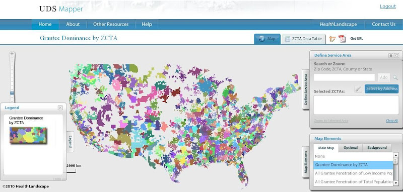
HealthLandscape Presents the UDS Mapper

HealthLandscape is pleased to present an additional tool within its online platform: the UDS Mapper

In a period of landmark health system reform and safety net expansion, it is essential that accessible tools and data are available to assist in evaluating the geographic extent of federally (Section 330)-supported health centers. As such, HRSA, John Snow, Inc. and the Robert Graham Center collaborated to develop this mapping and decision-support tool which is driven primarily from data within the Uniform Data System (UDS), previously not publicly accessible at the local level.


Register for access to the UDS Mapper at www.UDSMapper.org. Webinars to demonstrate the functionality of this tool will be offered weekly through August and September. Links to register for these webinars and other help tools can be found at http://www.udsmapper.org/webinars.cfm.

Monday, August 16, 2010

Commute to Work and Class of Worker

Two indicators from the American Community Survey (ACS) 2006-2008 Estimates are now available in HealthLandscape.

The data on means of transportation to work refer to the principal mode of travel or type of conveyance that the worker usually used to get from home to work during the reference week. People who used different means of transportation on different days of the week were asked to specify the one they used most often, that is, the greatest number of days. People who used more than one means of transportation to get to work each day were asked to report the one used for the longest distance during the work trip. The category "Car, Truck or Van" includes workers using a car (including company cars, but excluding taxicabs), a truck of one-ton capacity or less, or a van. The category "Public Transportation" includes workers who used a bus or trolley bus, streetcar or trolley car, subway or elevated, railroad, or ferryboat, even if each mode is not shown separately in the tabulation. The category "Other Means" includes workers who used a mode of travel that is not identified separately within the data distribution.

Figure 1. Mean Travel Time to Work


Figure 2. Percent Using Public Transportation


The ACS Estimates on class of worker categorizes people according to the type of ownership of the employing organization. For employed people, the data refer to the person’s job during the previous week. For those who worked two or more jobs, the data refer to the job where the person worked the greatest number of hours. For unemployed people, the data refer to their last job. Respondents provided the data for the tabulations by writing on the questionnaires descriptions of their kind of business or industry and the kind of work or occupation they are doing.

Figure 3. Percent Private Wage and Salary Workers


For more information on these indicators, see American Community Survey and 2008 Subject Definitions.


Show the need.

Paint a portrait.

Tell the story.

Monday, August 9, 2010

Crime by State, 2008

New data available in HealthLandscape!

The FBI collects these data through the Uniform Crime Reporting (UCR) Program.

Data provides the rate of selected offenses per 100,000 inhabitants for each state.

Any comparisons of crime among different locales should take into consideration relevant factors in addition to the area's crime statistics. Variables Affecting Crime provides more details concerning the proper use of UCR statistics.

For more information, see 2008 Crime in the United States, Data Declaration.


Figure 1. Violent Crime Per 100,000 Inhabitants, 2008


Figure 2. Property Crime Per 100,000 Inhabitants, 2008


Show the need.

Paint a portrait.

Tell the story.

Monday, August 2, 2010

USDA Food Environment Atlas

New data available in HealthLandscape!

County-level data from the USDA Food Environment Atlas is now available in HealthLandscape. The Food Environment Atlas includes data on proximity to food stores and restaurants, food prices, nutrtion-related assistance programs, health, and community characteristics. These factors interact to influence food choices and diet quality. The Atlas was developed to centralize food- and nutrition-related information and provide a spatial overview of these statistics.

The Atlas is made up of three main categories. The Food Choices category includes information on access to healthy and affordable food. Some examples of indicators in this category include access and proximity to a grocery store, the number of fast-food restaurants, access to local foods, food assistance program participation, and availability of local foods.

Figure 1. Percent of Households with No Car and > 1 Mile from Grocery Store


Figure 2. WIC-Authorized Stores per 1000 Population


Figure 3. Number of Fast Food Restaurants


Health and Well-Being indicators contain information on the community's health and diets, including rates of diabetes and obesity, and physical activity levels.

Figure 4. Adult Obesity Rate


Community Characteristics are aspects of the community that can have an influence on the food environment, including the demographic composition, income and poverty statistics, and the number of recreation and fitness centers available to the population.

Figure 5. Percent of Students Free-Lunch Eligible


Show the need.

Paint a portrait.

Tell the story.

Tuesday, July 20, 2010

Internet Crime Complaints and Perpetrators by State, 2009

New data available in HealthLandscape!

HealthLandscape now contains 2009 data for Internet Crime Complaints by State and Internet Crime Perpetrators by State. The internet crime complaints data are 2009 state rates based on filings with the Internet Crime Complaint Center (IC3). The internet crime perpetrators data are based only on filings where the perpetrator's residence could be identified by IC3. The IC3, which began operation on May 8, 2000 as the Internet Fraud Complaint Center, was established as a partnership between the National White Collar Crime Center (NW3C) and the Federal Bureau of Investigation (FBI) to serve as a vehicle to receive, process, and refer criminal complaints regarding the rapidly expanding arena of cyber crime. IC3 was intended for and continues to serve the broader law enforcement community, including federal, state, and local agencies, which employ key participants in the growing number of Cyber Crime Task Forces. Since its inception, IC3 has received complaints across a wide variety of cyber crime matters, including online fraud (in its many forms), intellectual property rights matters, computer intrusions (hacking), economic espionage (theft of trade secrets), child pornography, international money laundering, identity theft, and a growing list of additional criminal matters.

For more informtion, see IC3, NW3C and FBI. The full reports for 2009 and all previous years are available for download from the annual reports section of the IC3 website.

In 2009, the IC3 website received 336,655 complaints (22.3% increase from 2008). Just over one-third of complainants resided in one of the four most populated states: California, Florida, Texas, or New York. While Alaska, Colorado, and the District of Columbia had a relatively small absolute number of complaints, they did have some of the highest per capita rates of complainants in the United States.

Figure 1. Percent of Total Individual Complaints by State, 2009


Figure 2. Complainants per 100,000 People by State, 2009


The state of residence for perpetrators was only reported 33% of the time. Among the complaints for which perpetrator information is available, more than half resided in one of the following states: California, Florida, New York, the District of Columbia, Texas, and Washington. The District of Columbia, Nevada, Washington, Montana, Utah, Delaware, Florida, and Wyoming had the highest per capita rates.

Figure 3. Percent of Perpetrators by State, 2009


Figure 4. Perpetrators per 100,000 People by State, 2009


Show the need.

Paint a portrait.

Tell the story.