Wednesday, November 14, 2012

HealthLandscape to Present at CIC Impact Summit

About 200 community indicators and data experts and practitioners are convening in College Park, MD, for the Community Indicators Consortium Impact Summit November 15 and 16.

Mark Carrozza, our Director of Health Informatics, will present the HealthLandscape Community Data Portal during the "New Developments in Data Visualization" session on Thursday, November 15 from 3:30 to 5:00 pm.

He will join more than 50 other presenters (including Lisbeth Schorr) across tracks devoted to sustainability, health, education, and indicators tools and approaches. See the full list of presenters here.

This will be the place to be for anyone interested in the latest ways to use data to move community improvement across multiple issue areas. There is still time to register online, so please consider attending. You can save a bit by joining CIC as a member and then accessing the member rate for the conference.

Interested in learning more about HealthLandscape's Community Data Portal? Click the Register link below to sign up for a free webinar.

Wednesday, October 10, 2012

HealthLandscape Hosts U.S. CTO Todd Park and Presidential Innovation Fellows

Todd Park, U.S. CTO
HealthLandscape was honored to co-host the Innovation Open House Discussion with Todd Park, Chief Technology Officer of the United States, and several members of the first class of Presidential Innovation Fellows this past Friday. The National Underground Railroad Freedom Center (the event venue) was co-host.

Macon Phillips, Director of Digital Strategy at the White House
Local entrepreneurs, venture capitalists, and civic leaders spent one-on-one time with Mr. Park, Macon Phillips, Director of Digital Strategy at the White House, and several of the Fellows to discuss how government and business can work together to spur the economy and increase opportunity and job growth.

Conversation centered around the Presidential Innovation Fellows program's five projects:
  • Blue Button: Blue Button (@ProjectBlueBtn) will spread the ability for Americans to easily and securely download their own health information electronically. 
  • RFP-EZ: RFP-EZ (@ProjectRFPEZ) will streamline the "request for proposal" interaction between the government and small high-growth tech businesses, to make it easier for each to work with the other.
  • MyGov: MyGov (@ProjectMyGov) will make it easier for citizens to access information and services from the federal government.
  • The 20% Initiative: The 20% Initiative (@ProjectTwenty) will transition development assistance payments from cash to electronic methods, lowering administrative costs and reducing theft, fraud, and violence.
  • Open Data Initiatives: Open Data Initiatives (@ProjectOpenData) will accelerate and expand administration efforts to make government data more publicly accessible and encourage entrepreneurs to use the data to create new products, services, and jobs. (The Health Data Initiative [HDI] is among the first Open Data Initiatives. HealthLandscape has participated in all three HDI Forums, a.k.a. Health Datapaloozas.)
Park has been traveling around the country, hosting meetups, Datapaloozas (the Energy Datapalooza just wrapped up), and code-a-thons to find creative ways to spread the word and spark interest among entrepreneurs. The projects are tough, but tractable challenges whose solutions could provide immediate benefits and cost savings to citizens, entrepreneurs, and businesses.

"We're relying on the American entrepreneurial spirit to tackle these challenges," he said.

Thursday, September 27, 2012

Primary Care Physician Mapper App Launched

Explore the distribution of primary care physicians by state, county, or census tracts (in metropolitan areas) with the new Primary Care Physician Mapper.

The Primary Care Physician Mapper uses National Provider Identifier (NPI) data, and displays information for any provider who bills Medicare, Medicaid, or certain private insurance companies.

Users can visualize raw counts of physicians or create maps showing the ratio of one or more primary care specialties to the population within a selected geography.

The app, developed by HealthLandscape, is a project of the Robert Graham Center. There is no cost to users. For more information contact us at info@healthlandscape.org or visit www.HealthLandscape.org.


County-level map displaying the population to pediatric physicians in the Greater Cincinnati, Ohio, region.


Census tract-level map displaying the population to pediatric physicians with a threshold of at least 350 persons per provider in the Greater Cincinnati, Ohio, region.


Map displaying number and location of pediatricians in the Greater Cincinnati, Ohio, region.

Thursday, September 6, 2012

UDS Mapper: New Features and Updates

Map showing Health Center Program Grantee Dominance by ZCTA, 2011, for portions of Indiana, Ohio, and Kentucky.


UDS Mapper, a HRSA-funded project directed by the Robert Graham Center, helps inform users about the current geographic extent of U.S. federally (Section 330)-funded Health Center Program (HCP) grantees. It is one of many apps HealthLandscape has developed to visualize unique data sets.

Check out these new features and updates:

Individual Health Center Program Grantee Service Areas


In the Explore Service Area box (formerly the Define Service Area box), there are three optional functions:
  • By Geography: View patient and demographic data by Zip Code Tabulation Area (ZCTA).
  • New! By Patient Origin: Select individual HCP grantees and see their service areas according to patient-reported Zip Codes.
  • New! By Distance: Determine the potential service area included within a driving time or distance to a given point.


Map showing ten-minute drive time around Wheeling, West Virginia.


New! Population Indicator Sliders


In the Map Elements box, we've added a fourth tab, Population Indicators. Use this new feature to visualize the following population-based data by ZCTA:

  • % of population in poverty
  • % of population low-income (less than 200% of poverty)
  • % of population not employed
  • Low birth weight rate
  • Age-adjusted mortality rate (per 100,000)
  • % of adults ever told have diabetes
  • % of population uninsured
  • % of adults with no dental visit in past year
  • % of adults who have delayed or not sought care due to high cost
  • % of adults with no usual source of care

Data sources: American Community Survey (ACS) 2010 5-year and 3-year estimates; CDC Behavioral Risk Factors Surveillance Survey (BRFSS) 2010; CDC Vital Statistics 2009; CDC Area Resource File 2011

Use the indicator slider to adjust the rate. You will see the ZCTAs where the rate is greater than or equal to the number that you set on the slider.

Enhanced Rollovers


Roll your mouse over a ZCTA and see a list of up to five HCP grantees with the share of total HCP patients each center sees.

Most Current Data


UDS Mapper uses the most current data sets available, including the 2011 UDS data and the 2006-2010 ACS demographic estimates.

*****

Take advantage of upcoming training opportunities to demonstrate UDS Mapper's new features:

  • Webinar: September 19 (Click here to register. Content has been changed to focus on the new features of UDS Mapper.)

Or, if you're planning to attend the National Association of Community Health Centers (NACHC) Community Health Institute (CHI) conference in Orlando:
  • One-on-one training sessions: September 9-11 (To sign up, click here.)
  • What's New with the UDS Mapper: September 10
  • Community-Oriented Primary Care (COPC) training session/learning lab: September 11

Need more info? Click here to contact the UDS Mapper team.

Monday, August 20, 2012

Use Case: HealthLandscape and Healthcare Policy Decisions

HealthLandscape is not just the public-access tool you use when you visit www.HealthLandscape.org. HealthLandscape is also a platform on which use-case-specific data visualization tools are built.

In the video below, Bob Phillips and Andrew Bazemore, both of the Robert Graham Center of the American Academy of Family Physicians (AAFP) discuss how data visualizations have improved primary care delivery. Andrew (beginning at the 21:30 mark) describes the evolution of HealthLandscape and demonstrates how two tools that AAFP commissioned, UDS Mapper and Med School Mapper, have been used to help legislators make informed, data-driven policy decisions.


Their presentation, made in April 2012, was sponsored by the Australian Primary Health Care Research Institute at the Australian National University. APHCRI is developing HealthLandscape Australia, a platform that will visualize Australian healthcare workforce data, as well as other data sets.

HealthLandscape is a joint project of the Robert Graham Center and The Health Foundation of Greater Cincinnati.

Wednesday, August 8, 2012

Collective Impact and Backbone Organizations

Many communities and nonprofits now use the collective impact model to effect long-lasting change. If you're not familiar with the term collective impact, it is a relatively new model that encourages individual organizations to combine initiatives to address complex social problems in large-scale, collaborative ways.

One cornerstone of collective impact is the presence of one or more backbone organizations. A backbone organization is one that, as its name implies, provides structural, behind-the-scenes support to collaborating partners.

The Greater Cincinnati Foundation is one of Greater Cincinnati's backbone organizations. Through GCF and other regional backbone organizations, collective impact partners receive infrastructure, strategy, measurement, funding, and other system-level assistance.

Shiloh Turner, Vice President for Community Investment at the Greater Cincinnati Foundation, has been instrumental in bringing Cincinnati's Facts Matter data portal to life. Facts Matter, developed by HealthLandscape, is one tool among many in Greater Cincinnati's collective impact efforts.

Shiloh and coauthors Kathy Merchant, John Kania, and Ellen Martin recently wrote a four-part article, "Understanding the Value of Backbone Organizations in Collective Impact," for the Stanford Social Innovation Review. We've linked to the article below.

Part 1: Making a Commitment to Strengthen Backbone Organizations
Part 2: Key Learning: What Backbone Organizations Do
Part 3: Results of Inquiry: What We Learned
Part 4: What Next? Leading and Learning into the Future

Has your community adopted the community impact model? If so, what backbone organizations exist to support the model?

Thursday, August 2, 2012

Facts Matter Community Data Portal Wins First Place at Esri International User Conference


Conference attendees awarded HealthLandscape's Facts Matter community data portal first place in the "Web-Based GIS Application" category at the 2012 Esri International User Conference Software Applications Fair.


A great big thank you to everyone who test drove the Facts Matter Community Data Portal last week at the Esri International User Conference. We appreciate you selecting us as your favorite web-based GIS app during the User Software Applications Fair!

Facts Matter is a custom configuration of our community data portal. It provides the public with data about population demographics, the status of children and youth, education, health, economics, and social relations in the Greater Cincinnati/Northern Kentucky region.

Visit the Facts Matter Data Portal at http://www.crc.uc.edu/FACTSMATTER/index.htm.

Related Topics:

Thursday, July 26, 2012

HealthLandscape Presents Three Papers at 2012 Esri International User Conference

HealthLandscape was well-represented at the Esri International User Conference in San Diego, California, this week.

Jené Grandmont, HealthLandscape's Data Manager, presented "The Relationship Between Obesity and Poverty: Bivariate Spatial Visualization" during the Access to Health Foods and Health Outcomes session. She demonstrated how HealthLandscape's bivariate spatial visualization tool enables users to create maps based on percentile distributions of multiple variables. These maps better illustrate the relationship between variables such as obesity and poverty. Click on the video to see a quick demo of the tool.


Sean Finnegan of the Robert Graham Center, presented "Visualizing the United States Healthcare Workforce." This paper, coauthored by Jené, focused on using HealthLandscape interactive mapping and data visualization tools to display health workforce data from both the American Medical Association Physician Masterfile and the Centers for Medicare and Medicaid Services National Provider Identifier database. HealthLandscape's tools help users gain a better understanding of where physicians and other professionals are serving and where there are differences between the two databases.

Jené also presented the Facts Matter Data Portal, Greater Cincinnati's regional data portal, which was launched June 1. The data portal allows policymakers and community leaders to visualize the community indicators that are most relevant to Greater Cincinnati.

Why do we attend Esri's user conferences? The HealthLandscape app is built on the Esri ArcGIS platform, and it's important for us to stay current in technology and trends. We translate the complex underlying technology into an easy-to-use interface, which makes data visualization accessible to GIS and non-GIS professionals alike.

Congratulations also go out to Jené for being one of the top three female finishers at the conference's 5K run/walk. Jené, an avid runner, also competed in Cincinnati's Flying Pig Marathon in May.

For more information about the bivariate spatial visualization tool, health workforce data, or the Facts Matter data portal, contact us at info@healthlandscape.org.

Coauthors of "The Relationship Between Obesity and Poverty: Bivariate Spatial Visualization": Mark Carrozza, HealthLandscape's Health Informatics Developer, and Carolyn Borton and Stephen Ansari, both of Blue Raster. 

Coauthor of "Visualizing the United States Healthcare Workforce": Sean Finnegan, Robert Graham Center.

Coauthors of "Greater Cincinnati Data Portal": Ed Carl, Mark Carrozza, and Michael Topmiller of HealthLandscape; and Facts Matter data/funding partners Eric Avner of the Carol Ann and Ralph V. Haile, Jr./U.S. Bank Foundation; Eric Rademacher, Institute for Policy Research, University of Cincinnati; Jennifer Chubinski, The Health Foundation of Greater Cincinnati; and Shiloh Turner, Greater Cincinnati Foundation.

Thursday, June 28, 2012

Data Focus: The American Community Survey


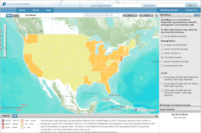
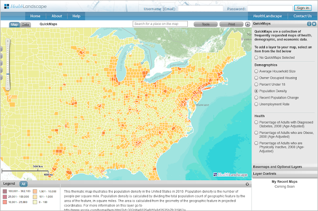
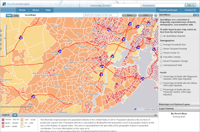
A map generated from HealthLandscape's ACS QuickMaps tool showing percent of persons under 18 below poverty in the Greater Cincinnati region.


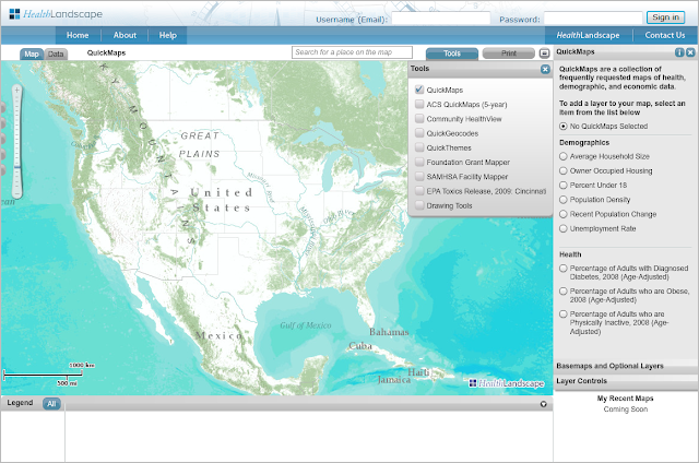
HealthLandscape's ACS QuickMaps tool was developed specifically to help you take advantage of the rich data available within the American Community Survey (ACS), the Census Bureau's newest product. Listed below are some FAQs about the survey, and how HealthLandscape makes this data available to you.


Is the American Community Survey the same as the ten-year census?


No. In fact, the ACS replaced the long form of the census in 2010. In simplest terms, the census is conducted every ten years, and is designed primarily to get a "head count," a count of the number of people in the United States and their general characteristics. The ACS is conducted every year and generates 1-year, 3-year, and 5-year data.

What kind of data does the American Community Survey collect?


The ACS collects demographic, social, economic, and housing data such as age, disability, poverty, education levels, race and ethnicity, and employment. (For a full list of topics, click here.)

What is the difference between 1-year, 3-year, and 5-year data?


Refer to the Census Bureau's chart for a detailed explanation. In general:
  • One-year data is 12 months of collected data, and describes areas with populations of 65,000 or more. It is the most current data, but it is also based on the smallest sample size, so it is less reliable than 3-year or 5-year data. One-year data is not available for small geographies.
  • Three-year data is 36 months of collected data, and describes areas with populations of 20,000 or more. It is less current than 1-year data, but more current than 5-year data. Three-year data is available for small geographies.
  • Five-year data is 60 months of collected data, and describes areas with populations of all sizes. It is the least current, but is based on the largest sample size and is therefore the most reliable. Five-year data is available down to the census tract level.
The data is updated every year. So, for example, in December 2011, 2006-2010 5-year estimates were released. At the end of 2012, 2007-2011 5-year estimates will be released.

HealthLandscape uses 5-year ACS data in our QuickMaps tool, and 5-year, 3-year, and 1-year data in our Community HealthView tool.

Where can I get more information about the ACS data sets included in HealthLandscape?


We publish metadata (data about the data) for each data set.

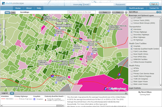
If you're using QuickMaps, look at the bottom center of the screen. You'll find general information about the data set, and a link to the Census Bureau for more information.

If you're using the Community HealthView tool, enter "American Community Survey" in the search box to locate ACS data. Then click the "about" link next to the data set. You'll see detailed metadata, including an abstract, type of data (1-year, 3-year, or 5-year), whether it's state, county, or tract-level data, what fields are included in the data set, and other useful information.


All ACS data is downloadable from the Census Bureau's web site. Our goal at HealthLandscape is to do some of that hard work for you, to make public data sets available in a way that's immediately useful to you and your organization. We want to help you show the need, tell your story, and explore alternatives.

Sign up for an Intro to HealthLandscape webinar to see ACS QuickMaps and Community HealthView in action. If you have specific questions about HealthLandscape or the American Community Survey, contact us at info@healthlandscape.org, or call 513-458-6674.

Thursday, June 14, 2012

Facts Matter Data Portal Wins Award at Datapalooza Health App Expo

CINCINNATI — Less than a week after its launch by United Way of Greater Cincinnati and community partners, Facts Matter received national recognition by health care technology experts during their annual expo.


Facts Matter provides the public with data about population demographics, the status of children and youth, education, health, economics and social relations in the Greater Cincinnati/Northern Kentucky region. The portal expands the community’s access to data and informs regional efforts to work together to improve our community. Facts Matter is built on the Community Indicators Data Portal, developed by HealthLandscape, and is the first of these portals to be launched nationwide.

The Community Indicators Data Portal was recognized in the “For Community” category during the 2012 Health Initiatives Forum, better known as “Health Datapalooza,” June 5-6 in Washington, D.C. The event brought together data experts, technology developers and health care system leaders to recognize innovative applications that raise awareness of health and health care systems, and spark community action to improve health.

“We’re very honored to have received this award,” said Mark Carrozza, health informatics developer at HealthLandscape. “At first, we were just excited to be one of the 17 teams chosen to present the data portal on stage out of more than 200 applicants. This award confirms that the Community Indicators Data Portal will be the go-to place for regional data."

The Facts Matter data portal project is supported by the staff of the Community Research Collaborative (CRC), a partnership between United Way of Greater Cincinnati and the Institute for Policy Research at the University of Cincinnati. The CRC provides support to policymakers, community leaders, and service providers to identify the health, social, and economic issues facing the Greater Cincinnati/Northern Kentucky region.

“Facts Matter is going to be a great resource for our entire community as we work to achieve our region's Bold Goals in the areas of education, income, and health,” said Terry Grundy, community impact director at United Way. “The information the portal provides will help us leverage our efforts as we work together for collective impact.”

Tuesday, June 5, 2012

HealthLandscape Community Data Portals Take Second Place at Health Datapalooza App Expo!

Register for a Facts Matter Training Session

Want to learn more about Facts Matter, Greater Cincinnati's online gateway to income, education, and health data?

Attend a live webinar (all webinars are one hour):
Or watch either of the videos below:

Facts Matter Overview


Using QuickGeocodes with Facts Matter


You can also download a QuickStart guide from the Facts Matter data portal Resources tab.

We want to make it as easy as possible for you to access and use this tool. If you have any questions, contact us at info@healthlandscape.org or call 513.458.6674.

Monday, June 4, 2012

Facts Matter, Cincinnati's Comprehensive Data Portal, Is Launched

Mark Carrozza, health informatics developer at HealthLandscape, demonstrates the Facts Matter comprehensive data portal at its June 1 launch. Facts Matter is deployed on the HealthLandscape mapping platform.

On Friday, June 1, the Greater Cincinnati nonprofit community gathered at the United Way of Greater Cincinnati's Fifth Third Convening Center for the launch of Facts Matter, the region's new online gateway to information about income, education, and health.

Facts Matter will be the go-to place for Greater Cincinnati regional data. Prior to its launch, community leaders had to gather income, education, health, and other data from a variety of sources. And much of that data was not region-specific. Facts Matter aims to change that.

Facts Matter:
  • Contains local indicators, indicators that the Greater Cincinnati community has agreed are important
  • Collects the data into one location and provides quick access to it
  • Uses data at a collective level, which increases the opportunity to make collective impact and offers a means for collective measurement
  • Makes data more tangible through a variety of visualizations
  • Fosters partnerships
  • Stays up-to-date, as opposed to state of the community reports which are snapshots in time, published every few years
Why do facts matter? Nonprofits have accountability issues. They must demonstrate to their funders, boards, program participants, and the community-at-large that their programs are necessary, effective, and worthy of continued support. And there is greater emphasis these days on data-driven decision making. "Access to strategic data guides decisions, helps in planning, and helps leaders evaluate success," said Stephanie Byrd, executive director of the United Way of Greater Cincinnati's Success By 6 initiative, who presented ways that Facts Matter can help agencies in program planning and accountability.

Jim Votruba, chair of the United Way of Greater Cincinnati's Research Council and soon-to-be-retired president of Northern Kentucky University, reinforced the importance of this tool. "To make progress, we need to confront the facts about ourselves and then act on them. This is a remarkable new civic resource. It will make our partnership work for community transformation just that much easier."

Facts Matter is a collaborative effort. Funding partners include the United Way of Greater Cincinnati, The Health Foundation of Greater Cincinnati, The Greater Cincinnati Foundation, and The Carol Ann and Ralph V. Haile, Jr./U.S. Bank Foundation. Data partners include Agenda 360, HealthLandscape, Northern Kentucky University, Strive Partnership, University of Cincinnati, and Vision 2015.

The portal currently contains 81 indicators. "All the data that we want in the portal is not in the portal," said Eric Rademacher, Co-Director of the University of Cincinnati Institute for Policy Research and Director of the Community Research Collaborative. "We will be inviting people to become data partners."

Visit Facts Matter at www.crc.uc.edu. Training opportunities are available through webinars and video tutorials. We will post links in a separate blog, for easy reference.

Thursday, May 17, 2012

Community Indicators Data Portal to Be Featured on Main Stage at Health Datapalooza

HealthLandscape will present our Community Indicators Data Portal application on June 5 at the Health Data Initiative Forum III, also known as Health Datapalooza. We are proud to be among only 17 teams chosen to present from the main stage, out of more than 200 applicants.

Health Datapalooza celebrates innovative applications that find meaningful uses for public health data, such as our Medicare Spending and Utilization Data Portal, shown below.

The Medicare Spending and Utilization Data Portal relies on the new Geographic Variation in Medicare Spending and Utilization database, which uses Medicare claims data to calculate utilization measures and total, standardized, and risk-adjusted spending.

We'll be among the data experts, technology developers, entrepreneurs, policy makers, health care system leaders, and community advocates in attendance.

Visit us in Washington, DC, at the Datapalooza, or watch the presentation via live webcast. You can also follow us on Twitter @HealthLandscape. The event hashtag is #healthdata.


Friday, April 27, 2012

We're Previewing Our Community Indicators Data Portal at United Way Community Leaders Conference

HealthLandscape specializes in creating data portals that make community data accessible, updatable, and interactive. (Check out our website for a few featured portals.)

The West Virginia Data Portal displays community indicators related to population, children and youth, educational attainment, health, and economy. The map above shows two indicators: per capita market income for 2009 (left) and 2012 Health Factors Rank (right).

We'll be previewing our Community Indicators Data Portal next week at the United Way Community Leaders Conference in Nashville.

Organizations like the United Way amass a lot of data, especially community indicator data. A community indicator is a way of measuring the health and well-being of a community. There are no standard indicators; typically, community organizations come together and work cooperatively to determine what needs to be measured and how they can do so.

Indicators can vary widely. They may include such measures as:
  • Requests for assistance with basic needs such as rent or utility payments
  • Food bank or food stamp usage statistics
  • Unemployment statistics
  • Home foreclosures
  • Infant mortality
  • Childhood overweight and obesity
  • Chronic diseases
HealthLandscape takes community indicator data (which is usually presented in table or graph form), and deploys it on our HealthLandscape mapping platform. The data comes alive, because:
  • It's given context: People understand the data in relationship to where they live
  • It's not static: Indicators can be overlaid and compared
  • It's visualized: What is difficult to see in a table becomes obvious on a map
How does your community measure its health and well-being? And how would a map make it easier to see?

Monday, April 16, 2012

How One Person Used Mapping to Improve Community Health

The Health Foundation of Greater Cincinnati (one of HealthLandscape's sponsoring organizations) and The Foundation for a Healthy Kentucky recently co-sponsored an event called "The Hot Spotter's Agenda: Targeting Resources to Achieve Quality Care." Keynote speaker was Dr. Jeffrey Brenner, a primary care physician in Camden, New Jersey.

Dr. Brenner's dramatic story is told in a 2011 New Yorker article by Atul Gawande. Dr. Brenner, who was on track to become a neuroscientist, instead changed his vocational focus after volunteering one day a week in a free primary care clinic during medical school. After seeing how patients were treated--or not, in one case--he became curious about the relationship between crime "hot spots" and health care delivery. He used maps to plot the data. Although he did not persuade city leaders to implement solutions based on his findings, he continued to collect and examine data and look for medical usage patterns using maps.

He made many discoveries. For example, he located the two blocks that accounted for more healthcare costs than any other in the city--totaling more than $200 million in healthcare bills in a 5.5-year period. He found that a single building sent more people to hospitals as a result of serious falls than any other, totaling almost $3 million in healthcare costs.

Dr. Brenner made meaningful use of the data. He has subsequently poured his efforts into the Camden Coalition of Healthcare Providers, an organization he founded to treat "superutilizers." His team has successfully built relationships with the patients they serve, and the Coalition's care has resulted in significant reductions in healthcare costs.

Click here to view Dr. Brenner's keynote entitled, "Bending the Cost Curve and Improving Quality in One of America's Poorest Cities." Also presenting are Greg Moody and Eric Friedlander, who give Ohio and Kentucky regional perspectives to the concept of "hot spotting."

Tuesday, April 10, 2012

Using Pinterest and HealthLandscape as a Way to Share Your Community Data

Have a Pinterest account? HealthLandscape does too. We just set ours up a week or so ago, so we can begin to showcase some of our tools and current projects. (Look for it to build out over time.)

Pinterest has taken hold because it harnesses the power of visual communication. Any image can be pinned—a photo, ad, infographic, data visualization, or video—and it will grab your viewer's attention quicker than words alone would.

So have you thought about using Pinterest as a way to share your mapped data? Your map + Pinterest could equal more traffic to your web site and more of your data getting out into the community!

Simply follow these steps:
  • Develop your map in HealthLandscape using our QuickGeocodes, QuickThemes, or Community HealthView tool.
  • Save the file.
  • Upload the finished file to your organization's Pinterest site. 
  • Be sure to add a description of the map and some creative copy that links to your organization's web site.
  • Anticipate referral traffic!
We created a QuickMap of population change data in the Detroit area and posted it on our Pinterest site as an example. Follow us there and see how Pinterest + HealthLandscape can work for you!

Monday, April 2, 2012

"Obesity and Food Insecurity" Published in Appalachian Health and Well-Being

Congratulations to Jennifer Chubinski, Director of Community Research at The Health Foundation of Greater Cincinnati, and our own Mark Carrozza, Health Informatics Developer at HealthLandscape, on publication of their chapter "Obesity and Food Insecurity" in the book Appalachian Health and Well-Being.

Their chapter examines the linkages between food scarcity and obesity in Appalachian rural and urban areas and, in particular, the Cincinnati area. Jennifer and Mark present the data as well as their recommendations for policy solutions and further research.
  
Appalachian Health and Well-Being is edited by Robert L. Ludke, Ph.D., a professor in University of Cincinnati's Department of Family and Community Medicine, and Phillip J. Obermiller, Ph.D., a senior visiting scholar in the School of Planning within University of Cincinnati's College of Design, Architecture, Art, and Planning (DAAP), and a fellow at the Appalachian Center, University of Kentucky. It is published by the University Press of Kentucky, and is available now from amazon.com in both hardcover and Kindle format.

Thursday, March 29, 2012

Infographic or Data Visualization?

What's the difference between an infographic and a data visualization? Robert Kosara, Associate Professor of Computer Science at UNC Charlotte, explains it well on his blog. He says, "The visualization is created by a tool that can be applied to many datasets, the infographic is hand-crafted for a particular dataset."

HealthLandscape creates data visualizations

With HealthLandscape, you can:
  • Use the tools again and again for multiple data sets.
  • Update your custom map at any time with more current data.
  • Interact with your data to better understand it.
    • View your data at multiple levels: state, county, census tract, or census block group.
    • Add our data layers to your data.
And you can do all of this without being a designer or a GIS professional!

We'd like to help you visualize your data. Contact us at info@healthlandscape.org.

Sidenote: Be sure to read the comments on Robert's post. His ZIPScribble maps are pretty cool too.

Monday, March 26, 2012

Open Government, Accessible Data: Let Your Voice Be Heard!

Making data open and accessible is a core value at HealthLandscape. We believe you should have full access to public data, in usable form.

Implementation of the Obama administration's 2009 Open Government Directive—which encourages transparency, collaboration, and participation by increasing access to government information—is now underway. The Department of Health and Human Services is inviting individuals to contribute their ideas to HHS's next Open Government Plan via an online survey: http://wcdapps.hhs.gov/OpenGovPublicInput/Survey.

Take advantage of this opportunity to let your voice be heard. Better hurry, though—deadline is April 9.

Tuesday, March 20, 2012

Hamilton County Public Health Launches the Community AHEAD Data Portal

Hamilton County Public Health, a public health department that serves more than 460,000 residents in the Greater Cincinnati area, recently partnered with HealthLandscape to create a data portal called Community AHEAD (Community Access to Hamilton County Epidemiology & Assessment Data).

Community AHEAD is a web-based, interactive tool that makes public health data accessible to Greater Cincinnati residents and community leaders. It presents a complete picture of community health at the neighborhood level using maps, charts, graphs, and tables.

Community AHEAD's map view showing neighborhood-level public health data on injuries due to falling.

Community leaders access the data portal to identify and prioritize specific patient populations. Hamilton County Public Health staff epidemiologists maintain and update the data portal regularly, which ensures that the data is current and continually relevant to the communities that Hamilton County Public Health serves.

Community AHEAD grew out of a collaboration between local hospital systems and Hamilton County Public Health. Hospitals, which are required to complete a community health assessment every three years, provided public health information to Hamilton County Public Health, which stored and collected the data. Hamilton County Public Health then worked with our subject matter experts Mark Carrozza and Jené Grandmont to develop Community AHEAD as a means to share the collated data with the reporting hospitals and the community.

HealthLandscape has developed data portals for other agencies, including the Kentucky Primary Care Association. Additional data portals are currently in development. We build the portals on the HealthLandscape platform, which enables us to incorporate the power of geographic information systems (GIS) into each portal.

Contact us at info@healthlandscape to inquire about our data portal development services or call 513.322.5141.

Tuesday, February 7, 2012

HealthLandscape Tools - QuickMaps

The newest version of HealthLandscape includes a feature called QuickMaps. QuickMaps is a tool that we've developed to help our users quickly and easily create maps of their communities.

QuickMaps includes a collection of frequently-requested indicators with state, county, tract, and blockgroup (where available) level data. The QuickMaps module is turned on by default when you login to HealthLandscape, but it is also accessible in the tools menu.


As you zoom in to smaller geographic areas, the map view will change from showing data at the state level...


...to showing data at the county level...


...to showing data at the census tract level and beyond, where available.


Basic Map Layers, including hospitals, health centers, geographic boundaries, and other features, can be added on top of the QuickMap selection to create more detailed maps.


Looking for data not currently featured in QuickMaps? Check out the American Community Survey (ACS) QuickMaps and Community HealthView. We will be detailing those tools in future blog posts!