Monday, December 16, 2013

New Data Portal Feature: Clustered Points for Multi-Site Locations

Think about your last visit to your doctor. Did you go to a medical office building or to a standalone practice?

The United Way of Greater Cincinnati shares the same address as the Visiting Nurses Association, Local Initiatives Support Corporation (LISC), and several affiliated United Way agencies.

So what, you're saying. Who cares?

Well, if you're mapping data, you should.

You see, some GIS data viz tools get confused when multiple agencies share the same physical address. They can only display one point on the map, so they pick one, usually the one "on top," the one the underlying code accesses first.

This isn't good.

Why? Because when you click on the point, you see data for only one agency, not every agency at that address. You get results for one clinic, not for every clinic in the building. The results can be incomplete at best, misleading at worst.

A screen shot showing one point that represents multiple sites.
The point could represent multiple clinics, physician practices, or social service agencies that all share the same address.


That's why we've added a new feature called clustered points to our Community Data Portal. It's a behind-the-scenes feature, one you don't have to access or configure in any way.

When you click on a point that has multiple sites, the points spread out. Each point becomes clickable, and each site's unique data becomes visible. You see all data relevant to that location, not just a portion of it.
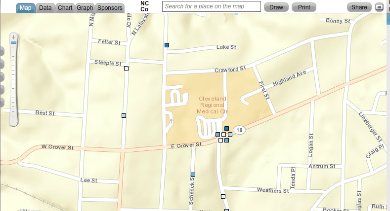

Map showing clustered points. When you click on a point that represents multiple sites,
the points spread out, showing data for every site at that location.


The Community Data Portal is but one way to map population data. Register today for one of our free HealthLandscape webinars to learn more about GIS data visualization.


Visualizing Data with HealthLandscape
Overview of all of our data visualization tools, including the Site Performance Explorer
Tuesday, December 17, 2:00 pm ET
Introduction to HealthLandscape
In-depth instruction on using HealthLandscape, our free online mapping tool and data library
Tuesday, January 7, 2:00 pm ET
The Community Data Portal
In-depth demonstration of our award-winning data dissemination tool
Tuesday, January 14, 2:00 pm ET

Monday, December 9, 2013

Congratulations to Michael Topmiller, PhD!

Michael Topmiller, PhD
Congratulations to Michael Topmiller on his recently awarded PhD from the University of Cincinnati Department of Geography. You've met Michael (virtually) if you've sat in on any of our webinars. He's the voice behind the slides, the person who so capably demonstrates our tools and answers your questions. When he's not presenting webinars, he's wrangling data sets and configuring mapping tools.

For his PhD, Michael focused on the Licking River Greenway and Trails (LRGT) in Covington and asked, "How does including local perceptions of safety change how we view access to physical activity resources, especially among low-income and minority populations?"

The LRGT extends along the Licking River in Northern Kentucky, and winds through several Covington neighborhoods, including Eastside, Helentown, Austinburg, Wallace Woods, and Levassor Park. Many residents there, particularly in Eastside, Helentown, and Austinburg, live in poverty.

Study area along the Licking River Greenway and Trails.
The map on the right shows the percentage of the population in poverty.


Sidewalk Audits and Participatory Mapping Show Neighborhood Conditions


Michael enlisted Covington residents, as well as adults from the Center for Great Neighborhoods and adolescents taking part in a week-long summer digital photography class called "Youth Picture Covington" to document access points and sidewalk quality. He also asked them to share their perception of safety along the greenways, recognizing that even the best sidewalks won't be used if residents are concerned about safety.

They assessed a number of features of the built environment, including:
  • Sidewalk presence: complete or incomplete
  • Sidewalk condition: good, fair, or poor
  • Traffic: no traffic, some traffic, heavy traffic
  • Safety: safe, neutral, not safe


Neighborhood Data Mapped for Better Analysis


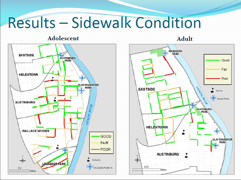
Michael then took participants' data and used GIS to analyze the results. He visualized both adult and adolescent data.

Mapped data showing locations of complete sidewalks.

Mapped data showing sidewalk conditions in study area.

Mapped data of local residents' perceptions of traffic volume in study area.


Mapped data of local residents' perceptions of safety in study area.


Findings analyzed and mapped against poverty levels.


Lessons Learned


Michael's research identified many positives:
  • Good proximity of access points to neighborhoods and schools
  • Good presence and quality of surrounding sidewalks
There were also some areas of concern:
  • High perception of poor safety and high traffic near schools and access points
  • Barriers to access are more prominent in under-resourced neighborhoods
Targeted interventions and policy changes should consider not only the built environment, but also local perceptions of safety and traffic volume.

Michael will be presenting several upcoming HealthLandscape webinars. He'll also be glad to answer questions about his research during the webinars.

Register today to see how GIS visualization can help you see your neighborhoods in a new light.


The Community Data Portal
In-depth demonstration of our award-winning data dissemination tool
Tuesday, December 10, 2:00 pm EST
Visualizing Data with HealthLandscape
Overview of all of our data visualization tools, including the Site Performance Explorer
Tuesday, December 17, 2:00 pm ET
Introduction to HealthLandscape
In-depth instruction on using HealthLandscape, our free online mapping tool and data library
Tuesday, January 7, 2:00 pm ET