Showing posts with label GIS. Show all posts

Wednesday, October 28, 2015

What Counts? Data Forum Focuses on Innovations in Population Health

How do we move from data to action? I’m excited to be joined by a series of speakers this Thursday (October 29th) at Data! Fostering Health Innovation in Kentucky and Ohio in Erlanger, KY, where we will be exploring this question and presenting recent innovations in improving population health.

As part of a panel focusing on the validity and use of data to address social determinants, I’ll be presenting HealthLandscape’s most recent work on Community Vital Signs, an approach for incorporating community indicators into electronic health records.  Also joining me on the panel are Katie Bachmeyer from Starfire, and Dr. Robert Kahn from Cincinnati’s Children’s Hospital.
Keynote speakers for the conference include Niall Brennan, the Chief Data Officer of the Centers for Medicare and Medicaid Services, and Naomi Cytron, Senior Research Associate in the Community Development Department for the Federal Reserve Bank of San Francisco.
 
Michael Topmiller
Health GIS Research Specialist 
HealthLandscape 
 

Wednesday, September 30, 2015

Esri Health Conference, 2015

Mark Carrozza, Dirctor of HealthLandscape, recently blogged about the idea that "Place Matters," especially when it comes to health and health care. It was fitting, then, that HealthLandscape had two presentations on the agenda at this year's Esri Health Conference, which was themed "Making Place Matter."


Our first presentation was an overview of two HealthLandscape tools - The Medicare Data Portal and Accountable Care Organization (ACO) Explorer. The aim of these tools is to help put the power of geographic visualization in the hands of researchers and policy makers. 

The Medicare Data Portal engages decision-makers and researchers with county and Hospital Referral Region (HRR) data from the Centers for Medicare & Medicaid (CMS) Geographic Variation database and the Chronic Conditions Warehouse. Users are able to visualize health outcome, cost, and demographic data for the Medicare population using maps, graphs, and trend charts. Users also have the ability to examine the relationship between two indicators (for example, Inpatient Costs and Diabetes) with side-by-side maps and a comparison tool that uses percentiles to visualize the relationship between variables. Users can choose from over 100 indicators across 6 categories, including Medicare Population data, Chronic Conditions, Utilization, Costs, Multiple Chronic Conditions, and Dartmouth Measures.


The ACO Explorer presents data for 211 Accountable Care Organizations, or ACOs. As part of the Affordable Care Act, new models of health care delivery have been developed, aimed at improving the quality of care while reducing costs. ACOs are being touted as potential solutions for the inefficiency and fragmentation of the U.S. healthcare system.  ACOs are made up of groups of doctors, hospitals, and other health care providers that coordinate care for Medicare beneficiaries. The tool allows users to visualize 33 quality metrics across five domains, which are compared against benchmarks set by CMS. Each point represents an accountable care organization. When you hover over or click on a specific site, flared rollover windows will appear that contain data about the quality measures included in each of the five domains, which will be colored red, yellow, or green based on their value respective to the thresholds. 

This set of tools can be accessed at www.healthlandscape.org/ACOExplorer/map.cfm. For more detailed information, check out our previous blog post, or sign up for an upcoming webinar.


In addition to the more traditional paper sessions, the conference plenary session featured a round of Lightning Talks, where each presenter had a strict 5 minute window in which to present their ideas. Mark presented the HealthLandscape GeoEnrichment API, a HIPAA-compliant Data as a Service (DaaS) solution that appends multiple geographic identifiers and small-area community characteristics to individual data. This project involves integrating social determinants of health data into patient level data to yield a broader view of the environmental and social risks specific to each patient by indicating whether patient lives in the presence of factors such as poverty, healthy food sources, walkable streets and parks, social capital, and much more.  


We're very excited about all of the possible applications of this simple, but powerful, tool, and we look forward to sharing our ideas and plans in future blog posts.


Jené Grandmont
Senior Manager, Application Development and Data Services
HealthLandscape

Monday, December 9, 2013

Congratulations to Michael Topmiller, PhD!

Michael Topmiller, PhD
Congratulations to Michael Topmiller on his recently awarded PhD from the University of Cincinnati Department of Geography. You've met Michael (virtually) if you've sat in on any of our webinars. He's the voice behind the slides, the person who so capably demonstrates our tools and answers your questions. When he's not presenting webinars, he's wrangling data sets and configuring mapping tools.

For his PhD, Michael focused on the Licking River Greenway and Trails (LRGT) in Covington and asked, "How does including local perceptions of safety change how we view access to physical activity resources, especially among low-income and minority populations?"

The LRGT extends along the Licking River in Northern Kentucky, and winds through several Covington neighborhoods, including Eastside, Helentown, Austinburg, Wallace Woods, and Levassor Park. Many residents there, particularly in Eastside, Helentown, and Austinburg, live in poverty.

Study area along the Licking River Greenway and Trails.
The map on the right shows the percentage of the population in poverty.


Sidewalk Audits and Participatory Mapping Show Neighborhood Conditions


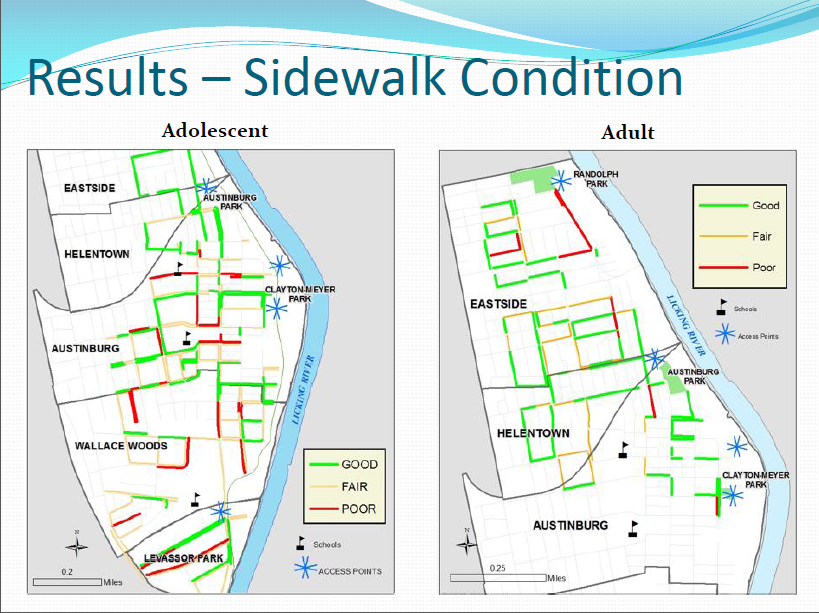
Michael enlisted Covington residents, as well as adults from the Center for Great Neighborhoods and adolescents taking part in a week-long summer digital photography class called "Youth Picture Covington" to document access points and sidewalk quality. He also asked them to share their perception of safety along the greenways, recognizing that even the best sidewalks won't be used if residents are concerned about safety.

They assessed a number of features of the built environment, including:
  • Sidewalk presence: complete or incomplete
  • Sidewalk condition: good, fair, or poor
  • Traffic: no traffic, some traffic, heavy traffic
  • Safety: safe, neutral, not safe


Neighborhood Data Mapped for Better Analysis


Michael then took participants' data and used GIS to analyze the results. He visualized both adult and adolescent data.

Mapped data showing locations of complete sidewalks.

Mapped data showing sidewalk conditions in study area.

Mapped data of local residents' perceptions of traffic volume in study area.


Mapped data of local residents' perceptions of safety in study area.


Findings analyzed and mapped against poverty levels.


Lessons Learned


Michael's research identified many positives:
  • Good proximity of access points to neighborhoods and schools
  • Good presence and quality of surrounding sidewalks
There were also some areas of concern:
  • High perception of poor safety and high traffic near schools and access points
  • Barriers to access are more prominent in under-resourced neighborhoods
Targeted interventions and policy changes should consider not only the built environment, but also local perceptions of safety and traffic volume.

Michael will be presenting several upcoming HealthLandscape webinars. He'll also be glad to answer questions about his research during the webinars.

Register today to see how GIS visualization can help you see your neighborhoods in a new light.


The Community Data Portal
In-depth demonstration of our award-winning data dissemination tool
Tuesday, December 10, 2:00 pm EST
Visualizing Data with HealthLandscape
Overview of all of our data visualization tools, including the Site Performance Explorer
Tuesday, December 17, 2:00 pm ET
Introduction to HealthLandscape
In-depth instruction on using HealthLandscape, our free online mapping tool and data library
Tuesday, January 7, 2:00 pm ET

Wednesday, November 20, 2013

GIS Data Visualization: Indispensable for Policymakers and Community Leaders

The Data! Fostering Health Innovation in Kentucky and Ohio conference proved to be a showcase for GIS technology in practice.
The Data! Fostering Health Innovation in Kentucky and Ohio conference
proved to be a showcase for GIS technology in practice.
Geospatial data visualization is an indispensable tool for policymakers and community leaders, as evidenced by yesterday's Data! Fostering Health Innovation in Kentucky and Ohio conference. Although the conference was not intended to be a showcase for geospatial information system (GIS) technology, almost every presenter used geospatial data visualization and analysis to tell their story. In many cases, it was the story.

Here are three highlights from the day.


GE Aviation Uses GIS Data Visualization to Improve Employee Health


GE Aviation is using a customized version of HealthLandscape's Site Performance Explorer to bring common sense and creativity to its efforts to improve employee health. For example, GE used to spread a "Stop Smoking" message only among its workers. Now the company uses GIS data visualization to see the prevalence of smoking in the communities that surround its sites. When a visualization shows high smoking rates, GE extends its nonsmoking promotions throughout the community because the company recognizes that employees are more likely to stop smoking if their friends and family members don't smoke. GE uses their customized app to address other health issues as well, such as improving employee access to primary care providers and promoting health screenings.

Why GIS? Because GIS data visualization draws attention to factors within a community that can directly affect an organization.

The City of Louisville Tackles Asthma Using GIS Data Visualization


Ted Smith, Chief of Economic Growth and Innovation for the city of Louisville, Kentucky, is using GIS data visualization not only to improve residents' health, but also to increase the region's economic vitality.

Statistics show that Louisville has extremely poor air quality--among the worst in the nation--making it a challenging place for people with asthma to live. High asthma-related emergency room admission rates and poor air quality scores make it difficult to attract and retain businesses. Smith has initiated a program with Propeller Health to supply Louisville-area residents with GIS-equipped inhalers. Each time a patient uses their inhaler, sensors record when and where the puff was taken. Analysts then combine inhaler data with weather, air pollution, traffic pattern, and other large data sets to look for ways to intervene, on both the patient and the policy level.

There have already been some surprising findings. For example, residents generally avoid living on the city's west side, where large industrial complexes are located and pollution levels are perceived to be high. Data have shown, however, that particulate matter levels are much higher in Louisville's wealthiest neighborhoods, likely due to weather patterns and the city's topographical characteristics. GIS data visualization shows just how pronounced the difference is.

Why GIS? Because GIS data visualization can show truths that run counter to our intuition.

Ohio-Kentucky-Indiana Regional Councils of Government Uses Crowdsourcing to Map Bike Routes 


Ohio-Kentucky-Indiana Regional Councils of Government (OKI) wanted to create bike route maps for Northern Kentucky and Ohio. They tried traditional outreach methods (e.g., email, meetings) to engage the cycling community. Their most successful effort was a survey conducted at local bike shops. They received a total of 34 responses.

OKI decided to try a new approach: crowdsourcing. They created a simple online mapping platform and invited the cycling community to add bike routes to the online map. They also invited riders to share their experiences with those routes. The resulting Bike Route Guide is now a permanent part of OKI's website (click here for the link).

Why GIS? Because GIS data visualization can invite participation and community engagement in a way that traditional methods do not.

At HealthLandscape, we strive to create GIS data visualization tools that don't require GIS specialists to use them. We want you to be able to make your data accessible, "mash it up" with other data sets, and use the visualizations to ask questions and formulate solutions to your community's challenges.

To learn more about our GIS data visualizations, attend one of our free webinars.

Introduction to HealthLandscape
In-depth instruction on using HealthLandscape, our free online mapping tool and data library
Thursday, December 5, 2:00 pm ET
The Community Data Portal
In-depth demonstration of our award-winning data dissemination tool
Tuesday, December 10, 2:00 pm EST
Visualizing Data with HealthLandscape
Overview of all of our data visualization tools, including the Site Performance Explorer
Tuesday, December 17, 2:00 pm ET

Thursday, October 3, 2013

Three Reasons Interactive GIS Data Visualizations Get Your Message Across Faster

Last week, we were among the featured innovators at an event that brought together emerging life science companies, prospective investors, policymakers, and other people who want to significantly improve health in the Greater Cincinnati region.

We set up in a beautifully appointed conference room and began rolling a video that highlighted several of the HealthLandscape tools on a giant LED monitor. Our presentation commanded the audience's attention.

Why? What was so compelling about these interactive maps?

We noticed that almost every person who stepped into the room engaged with what they were seeing in the same three ways:

They immediately had a frame of reference.

What did they look for first? Their neighborhood. Their community. Their landmarks. They quickly found where they belonged, and shifted their focus to the data we were presenting. We didn't have to spend time setting up the context. They already had it.

They immediately began looking for patterns.

People began asking questions and making observations: Why are so many clustered in that area? What does that shading represent? That's not what I would have expected there. I'm surprised that number isn't higher. People quickly began trying to make sense of the complex data. Seeing the data geographically energized and engaged them.

They immediately wanted to take the data further.
Once the initial observations were made, the audience wanted to dig deeper. They wanted to find meaning in the data. They wanted to not just observe a pattern but also understand why the pattern might be occurring. Is there a high level of unemployment in that area? What about poverty? Does that cluster of people with severe heart disease have access to a hospital? Because of HealthLandscape's interactive design and full library of community data, their questions could be addressed as their mental wheels were turning, while they were beginning to imagine ways to meet the identified need.
Our minds process visual information more quickly than textual information. One writer demonstrates this by placing a drawing of a circle next to a paragraph of text that gives a definition of a circle. Which do you have to work harder to understand: the image or the definition? And which will you remember?


Which do you understand more quickly--the map or the table? Both show the same data.


While any visualization has the potential to be "sticky," GIS visualizations go one step further because viewers have the potential to make a personal connection with the data. Your audience, whether it is a community of care providers, policymakers, funders, or the very people you serve, look for where they are in relation to the data, and ask, "How does this affect me?"

To learn more about HealthLandscape's interactive GIS data visualizations, attend one of our regularly scheduled webinars:

The Community Data Portal
In-depth demonstrations of our award-winning data dissemination tool
Thursday, October 3, 2:00 pm ET
Introduction to HealthLandscape
In-depth instruction on using HealthLandscape, our free online mapping tool and data library
Tuesday, October 8, 2:00 pm ET
Visualizing Data with HealthLandscape
Overview of all of our data visualization tools, including the Site Performance Explorer
Tuesday, October 22, 2:00 pm ET

Wednesday, July 10, 2013

will.i.am and i.am.angel Foundation Promote STEM Education Through GIS

Roosevelt High School students presenting their
GIS projects at the 2013 Esri User Conference.
We're at the Esri International User Conference this week and want to share with you two amazing presentations featuring will.i.am and the i.am.angel Foundation's work to integrate geographic information systems (GIS) with STEM education in the East LA neighborhood of Boyle Heights.

will.i.am at the 2013 Esri User Conference sharing his passion
for transforming his Boyle Heights neighborhood via STEM.
will's vision of transforming inner cities into desired places of living includes getting STEM tools into the hands of students at very young ages, and working with companies to invest in coding rooms instead of just basketball courts and football fields.

The first video ("STEM & GIS in Schools with Amber Case, Charlie Fitzpatrick, i.am.angel and Roosevelt High School," 19:24) shows four Roosevelt High School students and the local problems they visualized with GIS:
  • The disparity between race, income, and education as described by Jonathan Kozol in his book Savage Inequalities: Children in America's Schools
  • Access to parks ("We are a park poor community")
  • The high level of visual pollution (excess advertising via billboards)
  • The proximity of brownfields to students' residences
In the second video ("Special Guest will.i.am and Jack Dangermond," 39:30), will.i.am shares his passion to instill hope and bring real opportunity to neighborhoods like Boyle Heights, the Fifth Ward (Houston), and the Bronx.

To watch the videos, click here. You'll see the plenary videos listed in the center of the screen. Scroll down and look for the titles shown above. It's a bit of effort to find the videos, but worth it.

HealthLandscape is built on the Esri ArcGIS mapping platform. Contact us at info@healthlandscape.org to see how we can help you map your neighborhood.

Thursday, March 29, 2012

Infographic or Data Visualization?

What's the difference between an infographic and a data visualization? Robert Kosara, Associate Professor of Computer Science at UNC Charlotte, explains it well on his blog. He says, "The visualization is created by a tool that can be applied to many datasets, the infographic is hand-crafted for a particular dataset."

HealthLandscape creates data visualizations

With HealthLandscape, you can:
  • Use the tools again and again for multiple data sets.
  • Update your custom map at any time with more current data.
  • Interact with your data to better understand it.
    • View your data at multiple levels: state, county, census tract, or census block group.
    • Add our data layers to your data.
And you can do all of this without being a designer or a GIS professional!

We'd like to help you visualize your data. Contact us at info@healthlandscape.org.

Sidenote: Be sure to read the comments on Robert's post. His ZIPScribble maps are pretty cool too.

Tuesday, March 20, 2012

Hamilton County Public Health Launches the Community AHEAD Data Portal

Hamilton County Public Health, a public health department that serves more than 460,000 residents in the Greater Cincinnati area, recently partnered with HealthLandscape to create a data portal called Community AHEAD (Community Access to Hamilton County Epidemiology & Assessment Data).

Community AHEAD is a web-based, interactive tool that makes public health data accessible to Greater Cincinnati residents and community leaders. It presents a complete picture of community health at the neighborhood level using maps, charts, graphs, and tables.

Community AHEAD's map view showing neighborhood-level public health data on injuries due to falling.

Community leaders access the data portal to identify and prioritize specific patient populations. Hamilton County Public Health staff epidemiologists maintain and update the data portal regularly, which ensures that the data is current and continually relevant to the communities that Hamilton County Public Health serves.

Community AHEAD grew out of a collaboration between local hospital systems and Hamilton County Public Health. Hospitals, which are required to complete a community health assessment every three years, provided public health information to Hamilton County Public Health, which stored and collected the data. Hamilton County Public Health then worked with our subject matter experts Mark Carrozza and Jené Grandmont to develop Community AHEAD as a means to share the collated data with the reporting hospitals and the community.

HealthLandscape has developed data portals for other agencies, including the Kentucky Primary Care Association. Additional data portals are currently in development. We build the portals on the HealthLandscape platform, which enables us to incorporate the power of geographic information systems (GIS) into each portal.

Contact us at info@healthlandscape to inquire about our data portal development services or call 513.322.5141.