Showing posts with label Data Portal. Show all posts

Tuesday, May 10, 2016

Making Sense of Hot-Spots & Cold Spots

Today HealthLandscape is releasing Geospatial Brief #2 “Where are “Hot Spots” of Medicare Spending and Preventable Hospitalizations and “Cold Spots” of Preventive Care.  Brief #2 focuses on using advanced geospatial methods to identify priority areas for preventive care. This blog briefly describes different ways of defining hot spots and cold spots. We argue that it doesn’t necessarily matter how these terms are defined, as there are multiple methods for using these techniques to identify priority regions.

The term “hot-spotting” has become popular in the healthcare realm thanks to the work of Dr. Jeffrey Brenner in Camden, NJ, who identified a very small group of super-utilizers, which made up a disproportionate share of hospitalizations, ER visits, and healthcare costs.  These “super-utilizers” were often concentrated in small geographic areas, identified as hot spots, such as apartment buildings or city blocks, which were poor, under-resourced areas. Thus, by focusing on these hot-spots and providing coordinated care and social services, Brenner and his team were able to improve health, reduce unnecessary hospital visits, and lower costs (Gawande, 2011).  Brenner’s hot-spotting approach has been very successful and is being replicated in regions throughout the U.S., with the Robert Wood Johnson Foundation dedicating substantial funding for hot-spotting programs (RWJ, 2012).

Dr. John Westfall took an alternate view, wondering if the problem wasn’t really hot spots, but rather cold spots – “communities in which the social determinants of health, support, and access to primary care have broken down.” (Westfall, 2013).  Westfall explains that identifying cold spots and working to improve the conditions in these areas could have a larger overall impact on improving population health.  However, Westfall argues that addressing the needs of cold-spot communities is much more complex than dealing with a small group of super-utilizers, and requires a broader, communities of solution approach (Griswold et al., 2013).

Hot Spots and Cold Spots in Geospatial Analysis
While general awareness of the terms hot spots and cold spots have increased, these terms have different meanings in the field of geospatial analysis, where hot spots are defined as clusters of high values and cold spots as clusters of low values. These clusters are compared to random geographic patterns to test if they are statistically significant. Several methods exist for exploring hot spots and cold spots, including the Local Moran’s I (Anselin et al., 2006). For example, if you map Diabetes prevalence (Medicare) for counties in the U.S. (see map below), you would find clusters of high values throughout the southeast and Appalachia, and clusters of low values in the upper Midwest and throughout the Western part of the U.S. To test for statistically significant Diabetes hot spots, you would have to use advanced geospatial methods to determine if the clusters of high values are significantly different from random geographic patterns.


Diabetes Prevalence by County (Medicare) 
Source: CMS Geographic Variation, 2013; HealthLandscape Medicare Data Portal

Making Sense of Hot Spots and Cold Spots
There are similarities in how hot spots and cold spots described above are defined.  For example, if you had census tract data for 30-day readmission rates from a local hospital, you could map these data and visually identify census tracts with high rates (i.e., hot spots using Brenner’s definition).  Next, you could use geospatial methods (such as a Local Moran’s I) to determine if the clusters of high readmission rates are significantly different from a random pattern of hospital readmissions (i.e., hot spots using geospatial definition).  Similarly, you could map census tract education data to visually identify census tracts with low levels of education (i.e., cold spots using Westfall’s definition), and then use Local Moran’s I to determine if clusters of low education census tracts are statistically different from random patterns of education levels (cold spots using geospatial definition).

While there are many different ways to define hot spots and cold spots, there are all useful for identifying priority areas for place-based interventions. The key issue for future research is how we use the results of hot-spot and cold-spot analyses to target interventions.

Michael Topmiller
GIS Strategist
HealthLandscape 

References
Anselin, Luc, Ibnu Syabri and Youngihn Kho (2006). GeoDa: An Introduction to Spatial Data Analysis. Geographical Analysis 38 (1), 5-22.

Centers for Medicare and Medicaid (CMS), 2013. Geographic Variation Public Use File

Dartmouth Atlas of Health Care, 2013. Data Downloads.

Gawande, Atul. (2011). “The Hot Spotters: Can we lower medical costs by giving the neediest of patients better care?” The New Yorker. January 24, 2011.

Griswold, Kim S., Sarah E. Lesko, and John M. Westfall (Folsom Group). (2013). Communities of Solution: Partnerships for Population Health. Journal of the American Board of Family Medicine 26(3): 232-238.

HealthLandscape Medicare Data Portal

Robert Wood Johnson Foundation, (2012). “Expanding “Hot Spotting” to New Communities: What We’re Learning about Coordinating Health Care for High-Utilizers.”

Topmiller, Michael. (2016). “Do Regions with More Preventive Care have Lower Spending and Fewer Hospitalizations?”  HealthLandscape Geospatial Research Brief #1.
Accessed at http://www.healthlandscape.org/Geospatial-Analysis.cfm

Westfall, John M. (2013). Cold Spotting: Linking Primary Care and Public Health to Create Communities of Solution. Journal of the American Board of Family Medicine, 26(3): 239-240.

Wednesday, September 30, 2015

Esri Health Conference, 2015

Mark Carrozza, Dirctor of HealthLandscape, recently blogged about the idea that "Place Matters," especially when it comes to health and health care. It was fitting, then, that HealthLandscape had two presentations on the agenda at this year's Esri Health Conference, which was themed "Making Place Matter."


Our first presentation was an overview of two HealthLandscape tools - The Medicare Data Portal and Accountable Care Organization (ACO) Explorer. The aim of these tools is to help put the power of geographic visualization in the hands of researchers and policy makers. 

The Medicare Data Portal engages decision-makers and researchers with county and Hospital Referral Region (HRR) data from the Centers for Medicare & Medicaid (CMS) Geographic Variation database and the Chronic Conditions Warehouse. Users are able to visualize health outcome, cost, and demographic data for the Medicare population using maps, graphs, and trend charts. Users also have the ability to examine the relationship between two indicators (for example, Inpatient Costs and Diabetes) with side-by-side maps and a comparison tool that uses percentiles to visualize the relationship between variables. Users can choose from over 100 indicators across 6 categories, including Medicare Population data, Chronic Conditions, Utilization, Costs, Multiple Chronic Conditions, and Dartmouth Measures.


The ACO Explorer presents data for 211 Accountable Care Organizations, or ACOs. As part of the Affordable Care Act, new models of health care delivery have been developed, aimed at improving the quality of care while reducing costs. ACOs are being touted as potential solutions for the inefficiency and fragmentation of the U.S. healthcare system.  ACOs are made up of groups of doctors, hospitals, and other health care providers that coordinate care for Medicare beneficiaries. The tool allows users to visualize 33 quality metrics across five domains, which are compared against benchmarks set by CMS. Each point represents an accountable care organization. When you hover over or click on a specific site, flared rollover windows will appear that contain data about the quality measures included in each of the five domains, which will be colored red, yellow, or green based on their value respective to the thresholds. 

This set of tools can be accessed at www.healthlandscape.org/ACOExplorer/map.cfm. For more detailed information, check out our previous blog post, or sign up for an upcoming webinar.


In addition to the more traditional paper sessions, the conference plenary session featured a round of Lightning Talks, where each presenter had a strict 5 minute window in which to present their ideas. Mark presented the HealthLandscape GeoEnrichment API, a HIPAA-compliant Data as a Service (DaaS) solution that appends multiple geographic identifiers and small-area community characteristics to individual data. This project involves integrating social determinants of health data into patient level data to yield a broader view of the environmental and social risks specific to each patient by indicating whether patient lives in the presence of factors such as poverty, healthy food sources, walkable streets and parks, social capital, and much more.  


We're very excited about all of the possible applications of this simple, but powerful, tool, and we look forward to sharing our ideas and plans in future blog posts.


Jené Grandmont
Senior Manager, Application Development and Data Services
HealthLandscape

Monday, December 16, 2013

New Data Portal Feature: Clustered Points for Multi-Site Locations

Think about your last visit to your doctor. Did you go to a medical office building or to a standalone practice?

The United Way of Greater Cincinnati shares the same address as the Visiting Nurses Association, Local Initiatives Support Corporation (LISC), and several affiliated United Way agencies.

So what, you're saying. Who cares?

Well, if you're mapping data, you should.

You see, some GIS data viz tools get confused when multiple agencies share the same physical address. They can only display one point on the map, so they pick one, usually the one "on top," the one the underlying code accesses first.

This isn't good.

Why? Because when you click on the point, you see data for only one agency, not every agency at that address. You get results for one clinic, not for every clinic in the building. The results can be incomplete at best, misleading at worst.

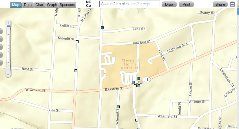
A screen shot showing one point that represents multiple sites.
The point could represent multiple clinics, physician practices, or social service agencies that all share the same address.


That's why we've added a new feature called clustered points to our Community Data Portal. It's a behind-the-scenes feature, one you don't have to access or configure in any way.

When you click on a point that has multiple sites, the points spread out. Each point becomes clickable, and each site's unique data becomes visible. You see all data relevant to that location, not just a portion of it.


Map showing clustered points. When you click on a point that represents multiple sites,
the points spread out, showing data for every site at that location.


The Community Data Portal is but one way to map population data. Register today for one of our free HealthLandscape webinars to learn more about GIS data visualization.


Visualizing Data with HealthLandscape
Overview of all of our data visualization tools, including the Site Performance Explorer
Tuesday, December 17, 2:00 pm ET
Introduction to HealthLandscape
In-depth instruction on using HealthLandscape, our free online mapping tool and data library
Tuesday, January 7, 2:00 pm ET
The Community Data Portal
In-depth demonstration of our award-winning data dissemination tool
Tuesday, January 14, 2:00 pm ET

Thursday, July 26, 2012

HealthLandscape Presents Three Papers at 2012 Esri International User Conference

HealthLandscape was well-represented at the Esri International User Conference in San Diego, California, this week.

Jené Grandmont, HealthLandscape's Data Manager, presented "The Relationship Between Obesity and Poverty: Bivariate Spatial Visualization" during the Access to Health Foods and Health Outcomes session. She demonstrated how HealthLandscape's bivariate spatial visualization tool enables users to create maps based on percentile distributions of multiple variables. These maps better illustrate the relationship between variables such as obesity and poverty. Click on the video to see a quick demo of the tool.


Sean Finnegan of the Robert Graham Center, presented "Visualizing the United States Healthcare Workforce." This paper, coauthored by Jené, focused on using HealthLandscape interactive mapping and data visualization tools to display health workforce data from both the American Medical Association Physician Masterfile and the Centers for Medicare and Medicaid Services National Provider Identifier database. HealthLandscape's tools help users gain a better understanding of where physicians and other professionals are serving and where there are differences between the two databases.

Jené also presented the Facts Matter Data Portal, Greater Cincinnati's regional data portal, which was launched June 1. The data portal allows policymakers and community leaders to visualize the community indicators that are most relevant to Greater Cincinnati.

Why do we attend Esri's user conferences? The HealthLandscape app is built on the Esri ArcGIS platform, and it's important for us to stay current in technology and trends. We translate the complex underlying technology into an easy-to-use interface, which makes data visualization accessible to GIS and non-GIS professionals alike.

Congratulations also go out to Jené for being one of the top three female finishers at the conference's 5K run/walk. Jené, an avid runner, also competed in Cincinnati's Flying Pig Marathon in May.

For more information about the bivariate spatial visualization tool, health workforce data, or the Facts Matter data portal, contact us at info@healthlandscape.org.

Coauthors of "The Relationship Between Obesity and Poverty: Bivariate Spatial Visualization": Mark Carrozza, HealthLandscape's Health Informatics Developer, and Carolyn Borton and Stephen Ansari, both of Blue Raster. 

Coauthor of "Visualizing the United States Healthcare Workforce": Sean Finnegan, Robert Graham Center.

Coauthors of "Greater Cincinnati Data Portal": Ed Carl, Mark Carrozza, and Michael Topmiller of HealthLandscape; and Facts Matter data/funding partners Eric Avner of the Carol Ann and Ralph V. Haile, Jr./U.S. Bank Foundation; Eric Rademacher, Institute for Policy Research, University of Cincinnati; Jennifer Chubinski, The Health Foundation of Greater Cincinnati; and Shiloh Turner, Greater Cincinnati Foundation.

Tuesday, June 5, 2012

HealthLandscape Community Data Portals Take Second Place at Health Datapalooza App Expo!

Register for a Facts Matter Training Session

Want to learn more about Facts Matter, Greater Cincinnati's online gateway to income, education, and health data?

Attend a live webinar (all webinars are one hour):
Or watch either of the videos below:

Facts Matter Overview


Using QuickGeocodes with Facts Matter


You can also download a QuickStart guide from the Facts Matter data portal Resources tab.

We want to make it as easy as possible for you to access and use this tool. If you have any questions, contact us at info@healthlandscape.org or call 513.458.6674.

Monday, June 4, 2012

Facts Matter, Cincinnati's Comprehensive Data Portal, Is Launched

Mark Carrozza, health informatics developer at HealthLandscape, demonstrates the Facts Matter comprehensive data portal at its June 1 launch. Facts Matter is deployed on the HealthLandscape mapping platform.

On Friday, June 1, the Greater Cincinnati nonprofit community gathered at the United Way of Greater Cincinnati's Fifth Third Convening Center for the launch of Facts Matter, the region's new online gateway to information about income, education, and health.

Facts Matter will be the go-to place for Greater Cincinnati regional data. Prior to its launch, community leaders had to gather income, education, health, and other data from a variety of sources. And much of that data was not region-specific. Facts Matter aims to change that.

Facts Matter:
  • Contains local indicators, indicators that the Greater Cincinnati community has agreed are important
  • Collects the data into one location and provides quick access to it
  • Uses data at a collective level, which increases the opportunity to make collective impact and offers a means for collective measurement
  • Makes data more tangible through a variety of visualizations
  • Fosters partnerships
  • Stays up-to-date, as opposed to state of the community reports which are snapshots in time, published every few years
Why do facts matter? Nonprofits have accountability issues. They must demonstrate to their funders, boards, program participants, and the community-at-large that their programs are necessary, effective, and worthy of continued support. And there is greater emphasis these days on data-driven decision making. "Access to strategic data guides decisions, helps in planning, and helps leaders evaluate success," said Stephanie Byrd, executive director of the United Way of Greater Cincinnati's Success By 6 initiative, who presented ways that Facts Matter can help agencies in program planning and accountability.

Jim Votruba, chair of the United Way of Greater Cincinnati's Research Council and soon-to-be-retired president of Northern Kentucky University, reinforced the importance of this tool. "To make progress, we need to confront the facts about ourselves and then act on them. This is a remarkable new civic resource. It will make our partnership work for community transformation just that much easier."

Facts Matter is a collaborative effort. Funding partners include the United Way of Greater Cincinnati, The Health Foundation of Greater Cincinnati, The Greater Cincinnati Foundation, and The Carol Ann and Ralph V. Haile, Jr./U.S. Bank Foundation. Data partners include Agenda 360, HealthLandscape, Northern Kentucky University, Strive Partnership, University of Cincinnati, and Vision 2015.

The portal currently contains 81 indicators. "All the data that we want in the portal is not in the portal," said Eric Rademacher, Co-Director of the University of Cincinnati Institute for Policy Research and Director of the Community Research Collaborative. "We will be inviting people to become data partners."

Visit Facts Matter at www.crc.uc.edu. Training opportunities are available through webinars and video tutorials. We will post links in a separate blog, for easy reference.

Thursday, May 17, 2012

Community Indicators Data Portal to Be Featured on Main Stage at Health Datapalooza

HealthLandscape will present our Community Indicators Data Portal application on June 5 at the Health Data Initiative Forum III, also known as Health Datapalooza. We are proud to be among only 17 teams chosen to present from the main stage, out of more than 200 applicants.

Health Datapalooza celebrates innovative applications that find meaningful uses for public health data, such as our Medicare Spending and Utilization Data Portal, shown below.

The Medicare Spending and Utilization Data Portal relies on the new Geographic Variation in Medicare Spending and Utilization database, which uses Medicare claims data to calculate utilization measures and total, standardized, and risk-adjusted spending.

We'll be among the data experts, technology developers, entrepreneurs, policy makers, health care system leaders, and community advocates in attendance.

Visit us in Washington, DC, at the Datapalooza, or watch the presentation via live webcast. You can also follow us on Twitter @HealthLandscape. The event hashtag is #healthdata.


Friday, April 27, 2012

We're Previewing Our Community Indicators Data Portal at United Way Community Leaders Conference

HealthLandscape specializes in creating data portals that make community data accessible, updatable, and interactive. (Check out our website for a few featured portals.)

The West Virginia Data Portal displays community indicators related to population, children and youth, educational attainment, health, and economy. The map above shows two indicators: per capita market income for 2009 (left) and 2012 Health Factors Rank (right).

We'll be previewing our Community Indicators Data Portal next week at the United Way Community Leaders Conference in Nashville.

Organizations like the United Way amass a lot of data, especially community indicator data. A community indicator is a way of measuring the health and well-being of a community. There are no standard indicators; typically, community organizations come together and work cooperatively to determine what needs to be measured and how they can do so.

Indicators can vary widely. They may include such measures as:
  • Requests for assistance with basic needs such as rent or utility payments
  • Food bank or food stamp usage statistics
  • Unemployment statistics
  • Home foreclosures
  • Infant mortality
  • Childhood overweight and obesity
  • Chronic diseases
HealthLandscape takes community indicator data (which is usually presented in table or graph form), and deploys it on our HealthLandscape mapping platform. The data comes alive, because:
  • It's given context: People understand the data in relationship to where they live
  • It's not static: Indicators can be overlaid and compared
  • It's visualized: What is difficult to see in a table becomes obvious on a map
How does your community measure its health and well-being? And how would a map make it easier to see?

Tuesday, March 20, 2012

Hamilton County Public Health Launches the Community AHEAD Data Portal

Hamilton County Public Health, a public health department that serves more than 460,000 residents in the Greater Cincinnati area, recently partnered with HealthLandscape to create a data portal called Community AHEAD (Community Access to Hamilton County Epidemiology & Assessment Data).

Community AHEAD is a web-based, interactive tool that makes public health data accessible to Greater Cincinnati residents and community leaders. It presents a complete picture of community health at the neighborhood level using maps, charts, graphs, and tables.

Community AHEAD's map view showing neighborhood-level public health data on injuries due to falling.

Community leaders access the data portal to identify and prioritize specific patient populations. Hamilton County Public Health staff epidemiologists maintain and update the data portal regularly, which ensures that the data is current and continually relevant to the communities that Hamilton County Public Health serves.

Community AHEAD grew out of a collaboration between local hospital systems and Hamilton County Public Health. Hospitals, which are required to complete a community health assessment every three years, provided public health information to Hamilton County Public Health, which stored and collected the data. Hamilton County Public Health then worked with our subject matter experts Mark Carrozza and Jené Grandmont to develop Community AHEAD as a means to share the collated data with the reporting hospitals and the community.

HealthLandscape has developed data portals for other agencies, including the Kentucky Primary Care Association. Additional data portals are currently in development. We build the portals on the HealthLandscape platform, which enables us to incorporate the power of geographic information systems (GIS) into each portal.

Contact us at info@healthlandscape to inquire about our data portal development services or call 513.322.5141.