Showing posts with label New Features. Show all posts

Monday, December 16, 2013

New Data Portal Feature: Clustered Points for Multi-Site Locations

Think about your last visit to your doctor. Did you go to a medical office building or to a standalone practice?

The United Way of Greater Cincinnati shares the same address as the Visiting Nurses Association, Local Initiatives Support Corporation (LISC), and several affiliated United Way agencies.

So what, you're saying. Who cares?

Well, if you're mapping data, you should.

You see, some GIS data viz tools get confused when multiple agencies share the same physical address. They can only display one point on the map, so they pick one, usually the one "on top," the one the underlying code accesses first.

This isn't good.

Why? Because when you click on the point, you see data for only one agency, not every agency at that address. You get results for one clinic, not for every clinic in the building. The results can be incomplete at best, misleading at worst.

A screen shot showing one point that represents multiple sites.
The point could represent multiple clinics, physician practices, or social service agencies that all share the same address.


That's why we've added a new feature called clustered points to our Community Data Portal. It's a behind-the-scenes feature, one you don't have to access or configure in any way.

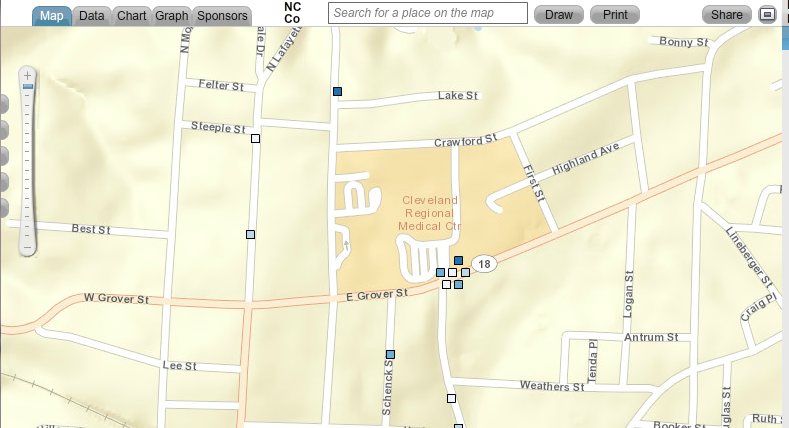
When you click on a point that has multiple sites, the points spread out. Each point becomes clickable, and each site's unique data becomes visible. You see all data relevant to that location, not just a portion of it.


Map showing clustered points. When you click on a point that represents multiple sites,
the points spread out, showing data for every site at that location.


The Community Data Portal is but one way to map population data. Register today for one of our free HealthLandscape webinars to learn more about GIS data visualization.


Visualizing Data with HealthLandscape
Overview of all of our data visualization tools, including the Site Performance Explorer
Tuesday, December 17, 2:00 pm ET
Introduction to HealthLandscape
In-depth instruction on using HealthLandscape, our free online mapping tool and data library
Tuesday, January 7, 2:00 pm ET
The Community Data Portal
In-depth demonstration of our award-winning data dissemination tool
Tuesday, January 14, 2:00 pm ET

Thursday, November 10, 2011

Introducing the New HealthLandscape

The Health Foundation of Greater Cincinnati and the American Academy of Family Physicians Release Major Upgrade to HealthLandscape.org Data Visualization Tool

CINCINNATI — The Health Foundation of Greater Cincinnati and the American Academy of Family Physicians (AAFP) announce a major upgrade to HealthLandscape.org, a web-based data visualization tool (www.healthlandscape.org) that allows healthcare payers, providers, policymakers, researchers, and community planners to perform spatial analysis on health-related data.

"We know that personal health is affected by many determinants outside our physical condition. For example, how does our community healthcare infrastructure, our social environment, our economic well-being affect our health?" asks Mark Carrozza, Health Informatics Developer at the Health Foundation of Greater Cincinnati and chief architect of the HealthLandscape.org tool. “HealthLandscape.org helps healthcare providers, payers, policymakers, and planners visualize the impact of such multiple factors on our health.”

In the past, health professionals needed to be highly specialized and extensively trained to make effective use of GIS (Geographic Information Systems) mapping tools. The new release of HealthLandscape has addressed many shortcomings of early systems. A few of the new features in this release include:
  • Ease of use - easily deployed by health professionals with modest information technology backgrounds
  • Pre-loaded datasets that include multiple factors affecting personal health with extensive ability to overlay several conditions on one screen (e.g. correlation of obesity and poverty)
  • Simple point-and-click access to health information. The data have already been uploaded
  • Quick maps, themes, and geocoding capabilities allow users to create maps almost instantly
  • Simple data upload capabilities that take output from electronic medical record systems or other database systems formatted as spreadsheets and pasted directly into HealthLandscape

"With HealthLandscape.org, users can upload their data through a simple spreadsheet, geocode it (turn addresses into mappable geographic coordinates) and then immediately create elegant, meaningful visual maps of that information," Carrozza says. "It’s a lot easier to see relationships in graphic form than it is to interpret data through tables or charts.”

Data visualizations created from a user’s own data are powerful. But HealthLandscape.org also provides superior access to public datasets through its new QuickMaps, QuickThemes, and Community Health View tools. Layering a user’s own data with public datasets such as average household size, percentage of the population in poverty, census data, transportation data, health professional shortage areas and other indicators offers insight not readily discernible any other way.

All maps can be stored on the web and made accessible wherever there is a web connection for use in reports, analyses, and presentations. “Adding graphic data to a presentation can quickly help users Show their Need, Tell their Story, and Explore Alternatives,” says Ed Carl, Executive Director of HealthLandscape, LLC.

HealthLandscape.org displays data from the national down to the neighborhood level in compliance with HIPAA data security requirements, thus ensuring confidentiality of all patient information.

HealthLandscape is a collaboration between The Health Foundation of Greater Cincinnati and the American Academy of Family Physicians. Both organizations are nonprofit enterprises that share the vision of improving the health condition of their constituents through better understanding of the underlying information that affects health.

“Our primary goal is to promote understanding and improvement of health and healthcare at all levels. HealthLandscape lets people become more involved in and better educated about the health of our communities,” says Pat O’Connor, Vice President and Chief Operating Officer of the Health Foundation of Greater Cincinnati. “Healthcare providers, grantees, and policymakers need powerful data and tools to inform their decisions. HealthLandscape.org can provide just those tools and data.”

"HealthLandscape can play a significant role for a much wider array of users to work with, display, share and benefit from community health data," said Andrew Bazemore, Assistant Director of the Robert Graham Center, American Academy of Family Physicians. "Policy makers think spatially. They look at maps and understand health in terms of their constituents in a way that simple tables do not permit. With HealthLandscape, health professionals in their communities will be able to use maps to better understand local issues and have the data needed to make more informed health policy decisions."


This map shows counties where obesity is a concern; darker shading means higher percentage obese.

*****
About the Health Foundation of Greater Cincinnati
The Health Foundation of Greater Cincinnati is an independent foundation dedicated to improving community health through grants, evaluation, and education. The Foundation works in Cincinnati and 20 surrounding counties in Ohio, Kentucky, and Indiana. For more information please visit www.healthfoundation.org.

About the American Academy of Family Physicians (AAFP)
The American Academy of Family Physicians is the United States’ national association of family physicians. It has more than 100,300 members in the 50 states and territories. The Academy was founded in 1947 to promote and maintain high quality standards for family doctors who provide comprehensive health care to the public. For more information please visit www.AAFP.org.

Wednesday, March 9, 2011

New Webinar - Using the Med School Mapper

The American Academy of Family Physicians’ Robert Graham Center for Policy Studies in Family Medicine and Primary Care publicly launched the Med School Mapper project back in November, 2010 Josiah Macy, Jr. Foundation (for details, please refer to the initial annoucement here).

We are now scheduling webinars to showcase this unique tool. The first webinar will take place on Tuesday, March 15, at 2:00PM. Please visit the registration page to sign up for the online session.

Amidst AAMC and COGME recommended expansion of medical education, principally through expansion of existing training sites, there is little mention and measurement of how the large investments of public dollars meet the needs of the citizens. In response to this, the Macy Foundation is funding the Medical Education Futures Study. This response is consistent with Macy’s mission to promote and evaluate the social responsiveness and mission of each medical school. Its ranking of schools by social accountability criteria is a novel first step in considering their social impact on a national scale. However, as state policymakers attempt to direct expansion funding forecasting for their own regional social and health care access needs, they have few tools for understanding the local and regional impact of schools. Neither national rankings, nor workforce models can truly capture the regional impact of training sites. The Robert Graham Center has created the Med School Mapper to study the means of demonstrating such an impact, using geographic and policy analyses of individual medical schools’ graduates.

Monday, February 14, 2011

Introducing HealthLandscape Version 3

The HealthLandscape team is pleased to announce the Beta launch of HealthLandscape Version 3.


We’re opening the new site in its testing stage for public access while we fine tune the layout and controls and finish the development of the modules you’re all familiar with, such as Community HealthView and My HealthLandscape. We'll also be soliciting feedback from our Beta users to get an understanding of what they like and don't like about the new site design, and ways that we can improve the usability and flow of the application.

To start using HealthLandscape V3, go to beta.healthlandscape.org. You will need to create a new account to view and use the mapping application. You can use the same email address and password that you used to sign up for the original HealthLandscape, but at this time the accounts will not be transferred over automatically.

HealthLandscape Version 3 is vastly different from the current HealthLandscape in a number of ways. We've designed the new HealthLandscape to be easier to use, with fewer mouseclicks required to get to the data that you need. Instead of wizards and lists of data categories and variables, there are more logical ways to organize and sort the data. This new design allows you to turn tools on and off depending on your data needs, and also allows you to display layers from multiple tools on the map at the same time.


Another way that we're improving the ease of use is through the introduction of Quick Maps and Quick Geocodes, tools that will be introduced to you over the next few weeks as part of a series of blog entries about the details of HealthLandscape V3.

We're very excited to share the new site and hope you enjoy exploring the updates.

Monday, November 15, 2010

Robert Graham Center Unveils Med School Mapper

The American Academy of Family Physicians’ Robert Graham Center for Policy Studies in Family Medicine and Primary Care publicly launched the Med School Mapper project on November 1, 2010, with funding provided by the Josiah Macy, Jr. Foundation.

Amidst American Association of Medical Colleges (AAMC) and Council on Graduate Medical Education (COGME) recommended expansion of medical education, principally through expansion of existing training sites, there is little mention or measurement of how the large investments of public dollars meet the needs of the citizens. In response to this, the Macy Foundation funds the Medical Education Futures Study (MEFS), whose main mission is “to highlight the social mission of medical education during the current period of medical school expansion and potential major health care reform. ” This ranking of schools by social accountability is a novel step in understanding their social impact on a national scale. However, as state policymakers attempt to direct expansion funding in terms of accountability to their own regional, social and health care access needs, they have few tools for understanding the local and regional impact of schools. Neither national rankings nor workforce models can capture the regional impact of training sites.

The Robert Graham Center has been studying means of demonstrating such an impact, using geographic and policy analyses of individual medical schools’ graduates (both allopathic and osteopathic). Using novel approaches to analyzing and displaying regional impact, the Med School Mapper will give planners essential information for directing and evaluating medical school expansion and its impact on access and other social aims. This tool utilizes American Medical Association (AMA) data, and ranks states and their medical schools on various areas of practice and the number and percent of graduates retained in state. The Mapper tracks the graduate footprint from a state, or medical school within that state, to provide a clear visualization of the practice locations of graduates by county, their penetration rates within counties, and information about the types of areas and specialties in which these graduates practice in order to provide data detailing how well a particular state or school meets its mission of social accountability.

Figure 1. State Footprint


Figure 2. School Footprint

Thursday, November 11, 2010

HealthLandscape Version 3.0 - Coming Soon!

The HealthLandscape team is in Washington, DC this week finishing up the development of HealthLandscape Version 3.0. We've been putting in long hours with our friends at Blue Raster and the Robert Graham Center making improvements to the current HealthLandscape. When HealthLandscape V3 is released, users will have access to a number of new tools including quick geocodes, quick maps, drawing tools, improved printing capabilities, and easy data exports, just to name a few.


We're very excited about the new developments. Many more details and final release date coming soon!

Tuesday, August 17, 2010

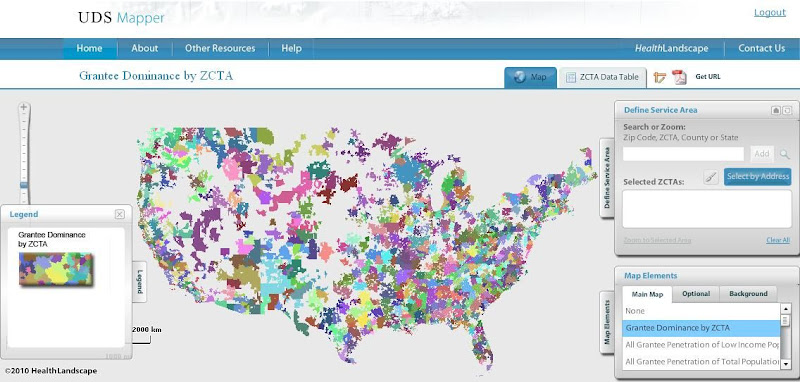
HealthLandscape Presents the UDS Mapper

HealthLandscape is pleased to present an additional tool within its online platform: the UDS Mapper

In a period of landmark health system reform and safety net expansion, it is essential that accessible tools and data are available to assist in evaluating the geographic extent of federally (Section 330)-supported health centers. As such, HRSA, John Snow, Inc. and the Robert Graham Center collaborated to develop this mapping and decision-support tool which is driven primarily from data within the Uniform Data System (UDS), previously not publicly accessible at the local level.


Register for access to the UDS Mapper at www.UDSMapper.org. Webinars to demonstrate the functionality of this tool will be offered weekly through August and September. Links to register for these webinars and other help tools can be found at http://www.udsmapper.org/webinars.cfm.

Monday, November 17, 2008

Imagine the stories you can tell with maps!

(Originally posted by Mark Carrozza at http://blogs.healthfoundation.org/HealthLandscape)

It's been said "If a picture paints a thousand words, then a map paints a thousand pictures." That's 1,000,000 words.

Imagine the stories you can tell with maps!

Welcome to the HealthLandscape Blog. In the coming months, we'll be introducing you to the features and data available in HealthLandscape, the new web-based mapping tool from The Health Foundation of Greater Cincinnati and the American Academy of Family Physicians.

Maps are everywhere, and HealthLandscape gives you the tools you need to create simple, effective displays of your neighborhood, your community, your state, or whatever area is important to you. By combining your data with our ever-expending library of local, state, and national data, HealthLandscape lets you reveal relationships in ways that would not be possible with mere tables and charts.

We encourge you to visit this blog often as we share the creative ways people use HealthLandscape, the new data we gather and publish, and the new features designed to enhance your maps and help you create compelling messages.

Visit HealthLandscape at www.healthlandscape.org and start telling your story today.

Feel free to come back here and tell us what you think or send us email at info@HealthLandscape.org


Show the need.

Paint a portrait.

Tell the story.