Showing posts with label Health Data. Show all posts

Wednesday, September 30, 2015

Esri Health Conference, 2015

Mark Carrozza, Dirctor of HealthLandscape, recently blogged about the idea that "Place Matters," especially when it comes to health and health care. It was fitting, then, that HealthLandscape had two presentations on the agenda at this year's Esri Health Conference, which was themed "Making Place Matter."


Our first presentation was an overview of two HealthLandscape tools - The Medicare Data Portal and Accountable Care Organization (ACO) Explorer. The aim of these tools is to help put the power of geographic visualization in the hands of researchers and policy makers. 

The Medicare Data Portal engages decision-makers and researchers with county and Hospital Referral Region (HRR) data from the Centers for Medicare & Medicaid (CMS) Geographic Variation database and the Chronic Conditions Warehouse. Users are able to visualize health outcome, cost, and demographic data for the Medicare population using maps, graphs, and trend charts. Users also have the ability to examine the relationship between two indicators (for example, Inpatient Costs and Diabetes) with side-by-side maps and a comparison tool that uses percentiles to visualize the relationship between variables. Users can choose from over 100 indicators across 6 categories, including Medicare Population data, Chronic Conditions, Utilization, Costs, Multiple Chronic Conditions, and Dartmouth Measures.


The ACO Explorer presents data for 211 Accountable Care Organizations, or ACOs. As part of the Affordable Care Act, new models of health care delivery have been developed, aimed at improving the quality of care while reducing costs. ACOs are being touted as potential solutions for the inefficiency and fragmentation of the U.S. healthcare system.  ACOs are made up of groups of doctors, hospitals, and other health care providers that coordinate care for Medicare beneficiaries. The tool allows users to visualize 33 quality metrics across five domains, which are compared against benchmarks set by CMS. Each point represents an accountable care organization. When you hover over or click on a specific site, flared rollover windows will appear that contain data about the quality measures included in each of the five domains, which will be colored red, yellow, or green based on their value respective to the thresholds. 

This set of tools can be accessed at www.healthlandscape.org/ACOExplorer/map.cfm. For more detailed information, check out our previous blog post, or sign up for an upcoming webinar.


In addition to the more traditional paper sessions, the conference plenary session featured a round of Lightning Talks, where each presenter had a strict 5 minute window in which to present their ideas. Mark presented the HealthLandscape GeoEnrichment API, a HIPAA-compliant Data as a Service (DaaS) solution that appends multiple geographic identifiers and small-area community characteristics to individual data. This project involves integrating social determinants of health data into patient level data to yield a broader view of the environmental and social risks specific to each patient by indicating whether patient lives in the presence of factors such as poverty, healthy food sources, walkable streets and parks, social capital, and much more.  


We're very excited about all of the possible applications of this simple, but powerful, tool, and we look forward to sharing our ideas and plans in future blog posts.


Jené Grandmont
Senior Manager, Application Development and Data Services
HealthLandscape

Tuesday, September 10, 2013

How Are You Measuring Health Promotion in Your Region?

How do you measure health promotion activities in your region? What performance indicators show that your health promotion efforts are producing results?

We're curious because one of our partner organizations, The Health Foundation of Greater Cincinnati,* has shifted its strategic direction away from access to care and toward health promotion. Now called Interact for Health, the organization's primary focus is on:
  • Healthy eating
  • Active living
  • Mental and emotional well-being
  • Healthy choices about substance use
Interact for Health has organized its new strategy around the National Prevention Council's National Prevention Strategy. In Appendix 2, the document lists categories of key indicators, including:
  • Goal indicators
  • Leading causes of death
  • Healthy and safe community environments
  • Clinical and community preventive services
  • Empowered people
  • Elimination of health disparities
  • Tobacco-free living
  • Preventing drug abuse and excessive alcohol use
  • Healthy eating
  • Active living
  • Injury and violence-free living
  • Reproductive and sexual health
  • Mental and emotional well-being
Many of the data sets that match the key indicators listed in the National Prevention Strategy are included in HealthLandscape's Community HealthView tool, which is easily accessible, free, and ready to use. To learn how to access data in Community HealthView, click the link below to sign up for an Introduction to HealthLandscape webinar.
How are you measuring health promotion? What's working for you?

*HealthLandscape, LLC is a partnership of Interact for Health and the American Academy of Family Physicians' Robert Graham Center.

Monday, June 4, 2012

Facts Matter, Cincinnati's Comprehensive Data Portal, Is Launched

Mark Carrozza, health informatics developer at HealthLandscape, demonstrates the Facts Matter comprehensive data portal at its June 1 launch. Facts Matter is deployed on the HealthLandscape mapping platform.

On Friday, June 1, the Greater Cincinnati nonprofit community gathered at the United Way of Greater Cincinnati's Fifth Third Convening Center for the launch of Facts Matter, the region's new online gateway to information about income, education, and health.

Facts Matter will be the go-to place for Greater Cincinnati regional data. Prior to its launch, community leaders had to gather income, education, health, and other data from a variety of sources. And much of that data was not region-specific. Facts Matter aims to change that.

Facts Matter:
  • Contains local indicators, indicators that the Greater Cincinnati community has agreed are important
  • Collects the data into one location and provides quick access to it
  • Uses data at a collective level, which increases the opportunity to make collective impact and offers a means for collective measurement
  • Makes data more tangible through a variety of visualizations
  • Fosters partnerships
  • Stays up-to-date, as opposed to state of the community reports which are snapshots in time, published every few years
Why do facts matter? Nonprofits have accountability issues. They must demonstrate to their funders, boards, program participants, and the community-at-large that their programs are necessary, effective, and worthy of continued support. And there is greater emphasis these days on data-driven decision making. "Access to strategic data guides decisions, helps in planning, and helps leaders evaluate success," said Stephanie Byrd, executive director of the United Way of Greater Cincinnati's Success By 6 initiative, who presented ways that Facts Matter can help agencies in program planning and accountability.

Jim Votruba, chair of the United Way of Greater Cincinnati's Research Council and soon-to-be-retired president of Northern Kentucky University, reinforced the importance of this tool. "To make progress, we need to confront the facts about ourselves and then act on them. This is a remarkable new civic resource. It will make our partnership work for community transformation just that much easier."

Facts Matter is a collaborative effort. Funding partners include the United Way of Greater Cincinnati, The Health Foundation of Greater Cincinnati, The Greater Cincinnati Foundation, and The Carol Ann and Ralph V. Haile, Jr./U.S. Bank Foundation. Data partners include Agenda 360, HealthLandscape, Northern Kentucky University, Strive Partnership, University of Cincinnati, and Vision 2015.

The portal currently contains 81 indicators. "All the data that we want in the portal is not in the portal," said Eric Rademacher, Co-Director of the University of Cincinnati Institute for Policy Research and Director of the Community Research Collaborative. "We will be inviting people to become data partners."

Visit Facts Matter at www.crc.uc.edu. Training opportunities are available through webinars and video tutorials. We will post links in a separate blog, for easy reference.

Friday, April 1, 2011

CDC: Diabetes Surveillance System

New data available in HealthLandscape!

We have added the most recent data from the CDC Diabetes Surveillance System to HealthLandscape, both at www.healthlandscape.org and, in Quick Map form, at beta.healthlandscape.org. Variables include the Percent of Adults who are Physically Inactive, the Percent of Adults who are Obese, and the Percent of Adults who have Diabetes.

Figure 1. Percent of Adults Who Are Physically Inactive, 2008


Figure 2. Percent of Adults Who Are Physically Inactive, 2008 (HL3)


Diabetes Data and Trends, which includes the National Diabetes Fact Sheet and the National Diabetes Surveillance System, provides resources documenting the public health burden of diabetes and its complications in the United States. The surveillance system also includes county-level estimates of diagnosed diabetes and selected risk factors for all U.S. counties to help target and optimize the resources for diabetes control and prevention.

The prevalence of diagnosed diabetes and selected risk factors by county was estimated using data from CDC's Behavioral Risk Factor Surveillance System (BRFSS) and data from the U.S. Census Bureau’s Population Estimates Program. The BRFSS is an ongoing, monthly, state-based telephone survey of the adult population. The survey provides state-specific information on behavioral risk factors and preventive health practices. Respondents were considered to have diabetes if they responded "yes" to the question, "Has a doctor ever told you that you have diabetes?" Women who indicated that they only had diabetes during pregnancy were not considered to have diabetes. Respondents were considered obese if their body mass index was 30 or greater. Body mass index (weight [kg]/height [m]2) was derived from self-report of height and weight. Respondents were considered to be physically inactive if they answered "no" to the question, "During the past month, other than your regular job, did you participate in any physical activities or exercises such as running, calisthenics, golf, gardening, or walking for exercise?"

See the CDC Diabetes Surveillance System for more information.


Show the need.

Paint a portrait.

Tell the story.

Wednesday, January 12, 2011

Looking for More Data?

Visit OASIS - the Online Analysis and Statistical Information System. OASIS is a project funded by The Health Foundation of Greater Cincinnati as a way to make the results of research more accessible to its grantees and the general public.

OASIS now has a blog and a Facebook page, so check it out if you're interested in more data. You can also follow OASIS on Twitter.

Wednesday, September 22, 2010

Health Insurance Coverage by County, 2007

New data available in HealthLandscape!

The US Census Bureau's Small Area Health Insurance Estimates (SAHIE) for 2007 are estimates of health insurance coverage for all counties. This dataset includes county-level estimates on the number of people and the percentages of people with and without health insurance coverage for ages 18 to 64 years. For more information, see, SAHIE.

The Small Area Health Insurance Estimates (SAHIE) program was created to develop model-based estimates of health insurance coverage for counties and states. The program builds on the work of the Small Area Income and Poverty Estimates (SAIPE) program.

SAHIE released 2007 county estimates of people with and without health insurance coverage by:

• Ages 0-18; 0-64; 18-64; 40-64; and 50-64;

• Sex;

• People of all incomes and people at or below 200 percent or 250 percent of the poverty threshold; and

• Measures of uncertainty of the estimates.

This research is partially funded by the Centers for Disease Control and Prevention, National Breast and Cervical Cancer Early Detection Program (NBCCEDP). The CDC has a congressional mandate to provide screening services for breast and cervical cancer to low-income, uninsured, and underserved women through the NBCCEDP. Most state NBCCEDP programs define low-income as 200 or 250 percent of the poverty threshold.


Figure 1. Percent of Population Uninsured by County, 2007


Figure 2. Percent of Population at or Below 200% of Poverty Uninsured by County, 2007


Show the need.

Paint a portrait.

Tell the story.

Tuesday, August 17, 2010

HealthLandscape Presents the UDS Mapper

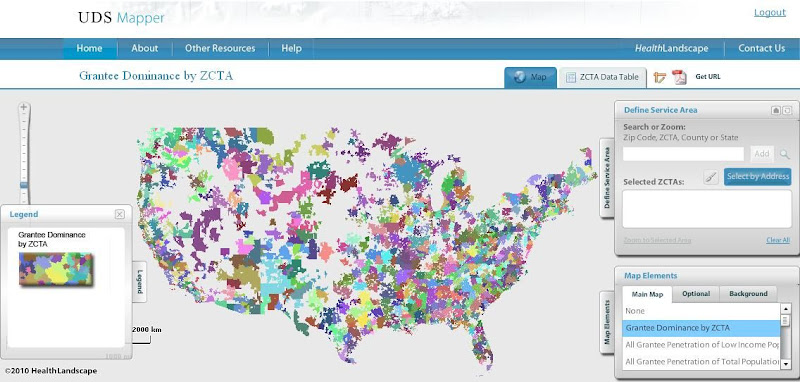
HealthLandscape is pleased to present an additional tool within its online platform: the UDS Mapper

In a period of landmark health system reform and safety net expansion, it is essential that accessible tools and data are available to assist in evaluating the geographic extent of federally (Section 330)-supported health centers. As such, HRSA, John Snow, Inc. and the Robert Graham Center collaborated to develop this mapping and decision-support tool which is driven primarily from data within the Uniform Data System (UDS), previously not publicly accessible at the local level.


Register for access to the UDS Mapper at www.UDSMapper.org. Webinars to demonstrate the functionality of this tool will be offered weekly through August and September. Links to register for these webinars and other help tools can be found at http://www.udsmapper.org/webinars.cfm.

Monday, August 2, 2010

USDA Food Environment Atlas

New data available in HealthLandscape!

County-level data from the USDA Food Environment Atlas is now available in HealthLandscape. The Food Environment Atlas includes data on proximity to food stores and restaurants, food prices, nutrtion-related assistance programs, health, and community characteristics. These factors interact to influence food choices and diet quality. The Atlas was developed to centralize food- and nutrition-related information and provide a spatial overview of these statistics.

The Atlas is made up of three main categories. The Food Choices category includes information on access to healthy and affordable food. Some examples of indicators in this category include access and proximity to a grocery store, the number of fast-food restaurants, access to local foods, food assistance program participation, and availability of local foods.

Figure 1. Percent of Households with No Car and > 1 Mile from Grocery Store


Figure 2. WIC-Authorized Stores per 1000 Population


Figure 3. Number of Fast Food Restaurants


Health and Well-Being indicators contain information on the community's health and diets, including rates of diabetes and obesity, and physical activity levels.

Figure 4. Adult Obesity Rate


Community Characteristics are aspects of the community that can have an influence on the food environment, including the demographic composition, income and poverty statistics, and the number of recreation and fitness centers available to the population.

Figure 5. Percent of Students Free-Lunch Eligible


Show the need.

Paint a portrait.

Tell the story.