Tuesday, May 28, 2019

Data Lovers Unite!

One thing the team at HealthLandscape believes in pretty consistently is the power of data visualization. We do it daily by building mapping and graphing tools, we teach it, we research it. We live it, we breathe it. That’s why it’s always great to go out to conferences and interact with our fellow data-philes (as you may have read earlier this week in our ACS Users Conference blog).

I try to live by the maxim don’t let the perfect get in the way of the good, particularly when it comes to health data. Health data are robust and fragile. They are comprehensive and limited. They are universal and unique. Since my role at HealthLandscape is primarily to teach people how to use our mapping tools, I try to gauge from an audience how much they care about the nuances and limitations of the datasets we use. Usually I get blank stares; after all, it’s not as fun listening to a list of datasets as it is to see a dynamic mapping tool in action and witness the power of those datasets.

This week, I represented the UDS Mapper at two conferences - the Northwest Regional Primary Care Association Spring Summit in Anchorage, Alaska, and the 2019 National Health Care for the Homeless Conference & Policy Symposium in Washington, DC. I had the opportunity to present in Anchorage and interact with attendees as an exhibitor in Washington. Aside from trying to sort out “when” I am after spanning so many time zones, I was surprised by how many people had deep questions about the data. Many people confessed to being closet data-philes and told me they want more. Their thirst for knowledge pushed me to really think about how these data could be used to answer their unique questions. They seemed to understand the data are not perfect and never will be, but are still useful and can help them continue to do the good work they are already engaged in.

Let the HealthLandscape team know about your data questions. Give us suggestions for new datasets we can add to our tools. Confess to us you are a data-phile. This is an inclusive, data-loving community and all are welcome!

P.S. I met one huge fan of the UDS Mapper this week, and I want to assure you all that if the future of public health data is up to her, we are in good hands.

Tuesday, May 21, 2019

2019 American Community Survey (ACS) Data Users Conference


The ACS Data Users Group is a partnership between the U.S. Bureau of the Census and the Population Reference Bureau, to promote the effective use and dissemination of ACS data, as well as educate users on data issues and best practices.

The annual ACS Data Users Conference, held May 14 and 15 this year, was a great opportunity to learn how others use ACS data, how the data can be used in concert with other federal and non-federal data sources, and how to keep up with the great data exploration and visualization tools people use (and develop) to get the maximum utility from this detailed demographic and economic data resource.

For me it was great to be introduced (actually, reintroduced) to the IPUMS data library at https://www.ipums.org/. I hadn’t visited their collection for the better part of five or more years, and they have really expanded their offerings. By focusing on data curation and dissemination, and NOT analysis and visualization, they have been able to create wide ranging and still detailed collections of census (lower case c) and administrative survey records. It’s very much worth a visit to their site if you’ve never been (or like me, have been away too long).


Our Contribution at the 2019 ACS Data Users Conference

For my part, I was able to give two well-received presentations, including one that I delivered with Annu Jetty of the Robert Graham Center.
Zhang et al., Am J Epidemiol. 2014;179: 1025–1033 

Both papers focused on our use of an innovative modeling technique developed by researchers from the Centers for Disease Control and Prevention (CDC) to create small (sub-county) area estimates for specific health behaviors and health outcomes. These estimates are derived from sub-county ACS population measures 
(diagram shown above). In the first presentation, we showed how the Health Resources and Services Administration (HRSA) and the UDS Mapper enable you to do cold spot analysis to find high-need areas. My second presentation showed how our Population Health Profiler can help health care providers learn more about the health of the community (“Community Vital Signs”) that matches their actual patient-derived service area. 

Try the tools mentioned above, find support resources, or contact us today for more information.

Mark Carrozza
Director, HealthLandscape

Friday, May 17, 2019

National Mental Health Month and the Mental Health Explorer


The World Health Organization defines health as “a state of complete physical, mental, and social well-being and not merely the absence of disease or infirmity.” While we have shifted our societal views on what we define as “healthy” and have molded programs to meet the needs of individuals, mental health stigma remains. Meanwhile, several figures in popular culture and other platforms have begun a crusade to de-stigmatize mental health issues. For example, President Obama championed and signed the 21st Century Cures Act in 2016 which took steps to ensure insurance companies treat mental health and substance use disorders more equitably. Mental Health America (MHA) has declared May National Mental Health Month. Additionally, many leaders around the world are encouraging safe spaces to discuss issues that millions of people struggle with daily.  


Background

Research confirms extensive mental health stigma and unmet need. Multiple studies from RAND state that mental health stigma is rampant in places like correctional facilities, professional work environments, and in the military. According to the CDC, 50% of Americans are diagnosed with a mental illness or disorder, and the third most common cause for hospitalization is mental illness, especially in the 18-44 age group. Mental Health America (MHA) fact sheets state 1 in 5, or in other words 9 million, American adults reported not having their mental health needs met. MHA reports that, compared to states with a large mental health provider workforce, “states with the lowest workforce [have] almost 4 times the number individuals to only 1 mental health provider.” In 2018, the Health Resources and Services Administration (HRSA) published a report projecting supply and demand for behavioral health occupations in 2030. Utilizing 2016 baseline data, the findings revealed behavioral health workforce variations by state and projected an overall shortage across 37 states, reaffirming the need for these services. As we become more cognizant about mental health issues and workforce deficits, policy makers must be careful to match limited resources and appropriate mental health supports to existing needs.  To assist policy makers, practitioners, and communities in these efforts, the team at HealthLandscape developed a tool which provides data illustrating mental health services and need across the nation.  


In May 2019, in conjunction with National Mental Health Month, HealthLandscape launched the Mental Health Explorer. The Mental Health Explorer (shown above) is a free, online tool based primarily on data available from the Robert Wood Johnson Foundation’s County Health Rankings. The County Health Ranking model uses over 30 data measures which leaders can use to advocate for health policy and program improvements in their communities.  The Mental Health Explorer features the Mental Health Mapper (shown below), which consolidates relevant County Health Rankings data, other mortality data, and workforce data in one tool for users to view their specific county level data pertaining to mental health and wellness.


Three additional capabilities are also available through the Mental Health Explorer: Mapping the mental health workforce, mapping community health data, and uploading other data sets for geocoding or analysis. The Mental Health Workforce Mapper (shown below) allows the user to view point and rate data on the mental health workforce. 


Community HealthView (shown below) is an extensive library of social, behavioral, and health measures. Finally, users can upload data to add to the map via the Map My Data feature.


Please refer to the Mental Health Explorer Quick Start Guide as you get started. The guide will help navigate the Mapper and its various tools, and help you examine mental health need in your community. If you have questions, contact us anytime.

Karin Natalie Pivaral for HealthLandscape
Dartmouth College Intern at the Robert Graham Center

Karin Pivaral is an MPH candidate at The Dartmouth Institute for Health Policy and Clinical Practice, Dartmouth College. As an intern with the Robert Graham Center, Karin conducted research in Primary Care Spend in the U.S. Karin’s Public Health research interests also include global health and health policy finance.


Monday, May 13, 2019

Maternal Mortality in the United States


Thanks in part to a recent surge in research, better data collection methods, and media attention, maternal mortality is once again on the minds of researchers, policy makers, and providers.  Previously considered a problem only in the developing world, the U.S. is now the most dangerous high-income country in which to give birth. In honor of National Women’s Health Week, we created a Story Map to further explore maternal mortality in the U.S., including contributing factors, geographic distribution, and potential solutions.


Background

Though disparate definitions of maternal mortality exist, it is defined by the CDC as the death of a pregnant woman or a woman within one year of giving birth ”from any cause related to or aggravated by the pregnancy or its management.” While many countries have made great strides in reducing maternal mortality, the United States has seen major setbacks. According to the CDC, between 1987 and 2014, the maternal mortality rate increased from 7.2/100,000 live births to 18.0/100,000 live births, more than doubling. 
Image source: CDC Pregnancy Mortality Surveillance System


A Story Map

Researchers site many factors that contribute to these statistics. In a 2017 series entitled “Lost Mothers: Maternal Mortality in the U.S.,” Martin and Montagne explore several of these factors, including racial disparities in health and access to health care. In the article “Black Mothers Keep Dying After Giving Birth,” as noted in Panel 4, the authors state that black women die at nearly four times the rate of white women, and these disparities persist across all income and education levels.  Martin and Montagne cite systemic social inequalities, poor access to care, and unconscious provider bias as contributing factors. In National Geographic, Jones expands on this concept by attributing maternal mortality racial disparities, in part, to “weathering,” the concept that the constant stress placed on racial and ethnic minorities by racism and bias leads to poor health outcomes.

Researchers also blame health care inequality and unequal access to care, explored in Panel 5. The U.S. is the only highly-developed county in the world without some form of universal health coverage, leading to women delaying or forgoing care they cannot afford. Additionally, uninsured women are more likely to suffer from chronic conditions which can lead to pregnancy complications. In fact, “women who lack health insurance are four times more likely to die of a pregnancy-related complication compared to their insured counterparts,” states Barone in Berkeley Wellness.

As Panel 6, also shown below, shows the geographic variation in maternal mortality is strongly correlated with other indicators of health and well being. The southern U.S. has the highest rates, with a maximum in Georgia at 46.2 deaths/100,000 live births.


The map in Panel 7 (left) shows county-level data following the same distribution as state-level data; however, county data are only available using 100,000 population as the rate denominator. So, while the state of Georgia has the highest maternal mortality ratio at 46.2 deaths/100,000 live births, county-level data for Jefferson County, for example, are reported as 1.14 deaths/100,000 population. Also noteworthy in Panel 7 is the ability to view mortality trends. Again, using Jefferson County as an example, we see maternal mortality has increased between 1985-2014 from 0.62 to 1.14/100,000 population, up 84%.

Next Steps

So what’s being done about this crisis in our midst? Organizations and initiatives are stepping up to create change. The American Academy of Family Physicians has implemented awareness campaigns, legislative initiatives, provider training, and innovative partnerships. The Health Resources and Services Administration (HRSA) convened a maternal mortality summit last year and has pledged to increase action via implementing best practices, increasing access to care via the Health Center Program, supporting providers, and more.  In California, the California Maternal Quality Care Collaborative (CMQCC) is being credited with reducing state maternal mortality rates by 55% using data-driven quality improvement initiatives.

Learn more about this issue, its geographic distribution, and improvement efforts in Maternal Mortality in the United States, and let us know if you have questions or feedback.


Jessica McCann
User Engagement Specialist, HealthLandscape

Thursday, April 18, 2019

The American Association of Geographers Annual Meeting: Building an International Geospatial Health Research Network (IGRHN)


I had the opportunity to spend a few days last week in Washington, D.C. at the American Association of Geographers Annual Meeting, where I presented a poster on research that explores access to treatment for opioid use disorder in high-need areas (maps below). My poster was part of the Geospatial Health Research Poster Session, which was one of many health-focused sessions at the conference.


On Friday, I was fortunate enough to spend the afternoon listening to global health experts discuss possibilities and opportunities related to building an international geospatial health research network (IGHRN). IGHRN is a relatively new initiative focused on building international networks of research and data sharing to address the most pressing issues facing the world today. Given the increasing access to big data across the world, it makes sense to try and create a network that can leverage these data to improve global health.

I, along with the rest of the HealthLandscape crew, am excited to see how the IGHRN develops over the next few years and to explore opportunities for collaboration. For example, we are working on updating and improving our World Health Explorer (coming summer of 2019), which is an online mapping tool that allows users to map dozens of country-level health indicators and explore trends over time.

HealthLandscape was built on collecting big data from disparate sources and developing novel visualization methods so users can gain new insights that would not have been possible if the data had remained siloed. 

Michael Topmiller, PhD
Health GIS Research Specialist, HealthLandscape


First-Time Impression of the American Association of Geographers Annual Meeting


Between April 3rd and April 6th, I attended, for the first time, the annual American Association of Geographers (AAG) meeting, in Washington, D.C. Coinciding with the peak bloom of the cherry blossoms and the return of warm weather to the capitol region, this meeting was a productive start to spring. I went with three objectives, 1) present work on automating and mapping the healthcare workforce, 2) host an Urban and Regional Information Systems Association (URISA) chapter meet and greet, and 3) attend the diverse sessions within the Geography, GIScience, and Health track.

On the morning of the third day, in the session labeled, “Conditions Impacting Healthcare Access”, I presented a brief overview of a project that I worked on throughout 2018. The American Medical Association (AMA) project includes two main deliverables as defined in the statement of work. The first is the production and delivery of 1,560 PDF maps showing the geographic distribution of the healthcare workforce, relative to population density. During my talk, I discussed how there was room for improvement over the previous methodology of creating these static maps. Next, I touched on the new methods that were used in the new 2018 project year, to automate the production of the same 1,560 maps through the use of Python programming. The other half of the project is for the development, update, and maintenance of the AMA Healthcare Mapper mapping application. I discussed the characteristics of the healthcare workforce and how users use this tool to map physician and non-physician providers. After my talk was finished, I fielded several topical questions that led me to believe that I had actually engaged the audience. Objective 1: SUCCESS!

Later that day, I hosted a one-hour URISA meet and greet. Since the end of 2018, I have been coordinating with representatives from URISA to revive the local URISA chapter that serves the Maryland, Washington, D.C., and Virginia region. I thought it would be a great opportunity, as AAG was coming to D.C., to request a room at AAG to try to meet some local URISA members. I reached out to several exhibitors like Pix4D, University of Maryland at College Park, GIS Certification Institute (GISCI), and URISA, to see if they could provide some free handouts I could use at the meeting. As I sat for close to 50 minutes in a room sparsely populated only with those waiting for the next session, I realized I should have cast a wider net during my email and Twitter (@URISACC) outreach campaign.  Objective 2: UNDER RECONSTRUCTION!

Before AAG 2019, I had been to numerous conferences, some that were GIS and spatial focused. With the AAG program having over 1,700 sessions, I was forced to pick my sessions of interest beforehand. Using the AAG app for Android, I starred my sessions of interest and hardly strayed, making logistics easier. Most of the sessions I attended were in the Geography, GIScience, and Health track, with some being in the general track like Cartography and Developing a Body of Knowledge for Cartography. The rest of my chosen sessions were focused on the role and use of GIS in population, community, urban, and international health. These sessions were filled with various members tied to academia presenting their latest findings. On April 6th, my last day of the conference, I attended a workshop on Geomasking Techniques…Involving Confidential Geospatial Data. The workshop was hosted by members of University of Michigan’s Inter-university Consortium for Political and Social Research (ICPSR), as well as the University of Illinois Urbana-Champaign. The aim of the workshop was two-fold, to introduce the Geospatial Virtual Data Enclave (GVDE), and discuss the methods used to geomask sensitive spatial data. The GVDE is a virtual data environment hosted by ICPSR, where prospective users request access by submitting an application detailing their IRB protocol, data management and security plan, and data use agreement. Once approved, they are given access to the virtual enclave where they have access to a variety of statistical packages (SAS, SPSS, R, STATA) and GIS software (ArcGIS for Desktop, GeoDa, QGIS). In the enclave, researchers can work with a variety of data that pertains to their project, but due to the sensitivity of the data stored in the GVDE, approvals are required for extracting any data from the enclave. The rest of the workshop provided an overview of the spatial methods of geomasking point data. The speakers from University of Illinois detailed the methods of aggregating point data to polygon layers and relocating point data. Both of these methods are useful on point data that’s considered sensitive like locations of sexual abuse victims or patients in medical records.  Objective 3: SUCCESS!

Overall, it was a positive and productive experience at AAG, one allowing me to see a few geo-celebrities like Esri president Jack Dangermond, International Cartographic Association (ICA) president Menno-Jan Kraak, former Attorney General Eric Holder, and cartography guru Kenneth Field. As I look onward to the next GIS conference (URISA GIS-Pro 2019), where I’ll present on workflow and process improvement with Python programming, I know that geography and GIS is where I want to be.

Dave Grolling
GIS Strategist, HealthLandscape


Thursday, February 7, 2019

The Rural Health Explorer

We’ve all seen the meme - a beautifully rustic cabin and the question, “Would you live here if you had to give up [insert something here]?” Sometimes it’s the internet, sometimes it’s football, but the truth is, people living in rural areas face the real possibility of doing without more than WIFI and professional sports. Research shows that rural Americans often have lower access to health care providers and facilities, as well as fewer educational opportunities, fewer food options, and decreasing job availability.

To help health care providers, policy makers, researchers, and other stakeholders better understand the potential needs of rural communities, HealthLandscape created the Rural Health Explorer.

The HealthLandscape Rural Health Explorer includes the Rural Population Health Mapper, Appalachia Community Data Portal, and Rural Health Workforce Mapper (all described below). The Explorer also includes other mapping tools focused on health behaviors, health outcomes, and healthy living assets in non-urban counties across the U.S., as well as the entire Appalachian region.  

Rural Population Health Mapper

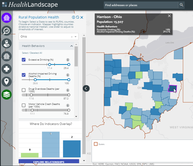
The Rural Population Health Mapper draws from the RWJ County Health Rankings data to let users explore behaviors and health care resources that impact health outcomes, as well as policies and program initiatives that can impact these measures. Results are for ONLY non-metro counties, as classified by the USDA ERS Rural-Urban Continuum Codes.

In the example below, we’ve selected the State of Ohio, and focused on percent of adults reporting Excessive Drinking and the percent of Alcohol-Impaired Driving Deaths. The slider controls for Excessive Drinking are set to the national median (17.4%) and the national maximum (29.4%). The two vertical marks on the slider show you the range of Excessive Drinking for Ohio counties. The user can adjust the slider to meet their needs.

By turning on two or more indicators (two, in this example), you can see the overlap or areas where counties meet both conditions. For example, we highlight Harrison County in eastern Ohio, with an Excessive Drinking rate (18%) AND percent of Alcohol-Impaired Driving Deaths (29.6%) above the national medians.


Appalachia Community Data Portal

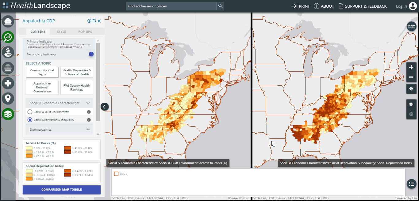
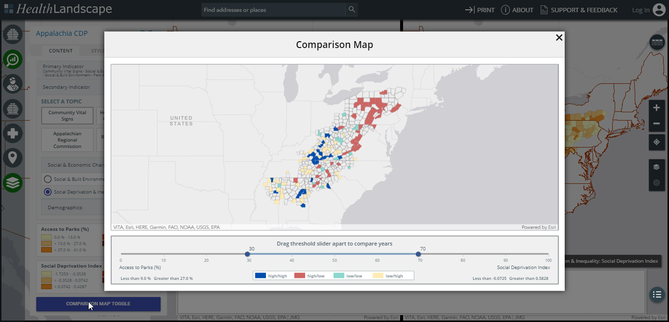
The Appalachia Community Data Portal focuses on the 420 counties in the 13-state Appalachian region that stretches from New York to Mississippi. It includes all of West Virginia and parts of Alabama, Georgia, Kentucky, Maryland, Mississippi, New York, North Carolina, Ohio, Pennsylvania, South Carolina, Tennessee, and Virginia. The Appalachia Community Data Portal combines county-level data from multiple sources, including economic status and health disparities data from the Appalachian Regional Commission (ARC); health outcomes, behaviors, and clinical care data from the Robert Wood Johnson County Health Rankings; and demographic and social determinants of health data from HealthLandscape’s Community Vital Signs data library.


In the examples below, we use the Appalachia Community Data Portal comparison mode to explore a side-by-side map, and a combined map, of Access to Parks and the Robert Graham Center Social Deprivation Index.


Rural Health Workforce Mapper

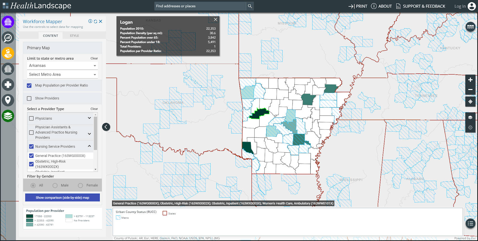
The Rural Health Workforce Mapper includes all rural AND urban counties, while focusing on targeted physician and non-physician specialties that are important members of the rural health care continuum.


In the example above, we are mapping the number of nursing service providers by county in Arkansas and highlighting Logan County, which has one provider and a population to provider ratio of 22,353:1. The map also highlights the number of non-metro counties that do not have any nursing service providers.

Interested in learning more? Attend one of our free, upcoming webinars. We'll demonstrate the tools within the Rural Health Explorer and answer any questions you may have. Register for this and other HealthLandscape webinars on our website.

If you're ready to get started now, be sure to download our Rural Health Explorer Quick Start Guide. This guide will help you navigate the Explorer and its various tools. If you have questions, contact us anytime.