Wednesday, February 25, 2015

Medicare Data Portal


Increased availability of health data through the U.S. Government’s Open Data Initiative has provided researchers, policymakers, and the general public with access to dozens of new datasets.  Despite the increased availability, the data are often cumbersome to work with and few tools exist that present the data in ways that are useful for the public and decision-makers.


We created a web-based data visualization and mapping tool, the Medicare Data Portal, to simplify access to this rich data source.


Comparison map where HRRs with high prevalence of Diabetes and low A1C Testing are displayed in Red

The Medicare Data Portal engages decision-makers and researchers with county and Hospital Referral Region (HRR) data from the Centers for Medicare & Medicaid (CMS) Geographic Variation database and the Chronic Conditions Warehouse.  The tool allows users to visualize health outcome, cost, and demographic data for the Medicare population using maps, graphs, and trend charts.  Users also have the ability to examine the relationship between two indicators (for example, Inpatient Costs and Diabetes) with side-by-side maps and a comparison tool that uses percentiles to visualize the relationship between variables.

The Medicare Data Portal can also be used simultaneously with other tools to explore relationships between hospital-level indicators and county and HRR-level Medicare indicators.  The portal can be used as a resource for policymakers and researchers concerned with Medicare spending and the relationships between Medicare costs and health outcomes.

Where can I try it?

Visit HealthLandscape at http://www.HealthLandscape.org

Select "Medicare Data Portal" from the HealthLandscape Tools

Want to Learn More?


Learn more about HealthLandscape with our online Webinars and Training
In-depth instruction on using HealthLandscape tools and additions to our ever-growing data library


Monday, January 5, 2015

Visualizing Global Health

Global health issues have received increased attention due to the Ebola outbreak, with President Obama recently asking Congress for $6 billion in the fight against the crisis. While the Ebola outbreak is serious and has resulted in thousands of deaths, a number of other diseases, such as HIV/AIDS and Tuberculosis, continue to plague countries throughout the world. Other health issues, including infant mortality, a shortage of doctors and nurses, and a lack of healthcare spending also play critical roles in shaping population health throughout the world. As researchers and policymakers continue to grapple with these issues, it is becoming increasingly important that relevant data and tools are easily accessible that can help shed light on these issues. One such tool is the World Health Mapper, a free web-based mapping and data visualization tool.

The World Health Mapper (http://www.healthlandscape.org/worldhealth/hlplayer.html) allows users to visualize data related to demographics, vital statistics, child and infant health, disease prevalence, and healthcare capacity & expenditures for countries across the world in the form of maps, charts, and graphs. Users also have the ability to examine the relationship between two indicators with side-by-side maps and a comparison tool that groups countries based on percentiles.

For example, the map shows the relationship between health care spending per capita and infant mortality, where red countries have high spending (70th percentile or greater) & low infant mortality (30 percentile or below), and light blue countries have low spending (30th percentile or below) and high infant mortality (70 percentile or greater).


The data come from a variety of sources, most notably the World Development Indicators Catalog produced by the World Bank and the Organization for Economic Co-operation and Development (OECD) Health Database.  In addition, the World Health Mapper contains data about the state of Family Medicine around the globe. 

The World Health Mapper is also available at the Center for Global Health Initiatives and the Robert Graham Center.


Monday, December 16, 2013

New Data Portal Feature: Clustered Points for Multi-Site Locations

Think about your last visit to your doctor. Did you go to a medical office building or to a standalone practice?

The United Way of Greater Cincinnati shares the same address as the Visiting Nurses Association, Local Initiatives Support Corporation (LISC), and several affiliated United Way agencies.

So what, you're saying. Who cares?

Well, if you're mapping data, you should.

You see, some GIS data viz tools get confused when multiple agencies share the same physical address. They can only display one point on the map, so they pick one, usually the one "on top," the one the underlying code accesses first.

This isn't good.

Why? Because when you click on the point, you see data for only one agency, not every agency at that address. You get results for one clinic, not for every clinic in the building. The results can be incomplete at best, misleading at worst.

A screen shot showing one point that represents multiple sites.
The point could represent multiple clinics, physician practices, or social service agencies that all share the same address.


That's why we've added a new feature called clustered points to our Community Data Portal. It's a behind-the-scenes feature, one you don't have to access or configure in any way.

When you click on a point that has multiple sites, the points spread out. Each point becomes clickable, and each site's unique data becomes visible. You see all data relevant to that location, not just a portion of it.


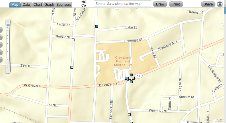
Map showing clustered points. When you click on a point that represents multiple sites,
the points spread out, showing data for every site at that location.


The Community Data Portal is but one way to map population data. Register today for one of our free HealthLandscape webinars to learn more about GIS data visualization.


Visualizing Data with HealthLandscape
Overview of all of our data visualization tools, including the Site Performance Explorer
Tuesday, December 17, 2:00 pm ET
Introduction to HealthLandscape
In-depth instruction on using HealthLandscape, our free online mapping tool and data library
Tuesday, January 7, 2:00 pm ET
The Community Data Portal
In-depth demonstration of our award-winning data dissemination tool
Tuesday, January 14, 2:00 pm ET

Monday, December 9, 2013

Congratulations to Michael Topmiller, PhD!

Michael Topmiller, PhD
Congratulations to Michael Topmiller on his recently awarded PhD from the University of Cincinnati Department of Geography. You've met Michael (virtually) if you've sat in on any of our webinars. He's the voice behind the slides, the person who so capably demonstrates our tools and answers your questions. When he's not presenting webinars, he's wrangling data sets and configuring mapping tools.

For his PhD, Michael focused on the Licking River Greenway and Trails (LRGT) in Covington and asked, "How does including local perceptions of safety change how we view access to physical activity resources, especially among low-income and minority populations?"

The LRGT extends along the Licking River in Northern Kentucky, and winds through several Covington neighborhoods, including Eastside, Helentown, Austinburg, Wallace Woods, and Levassor Park. Many residents there, particularly in Eastside, Helentown, and Austinburg, live in poverty.

Study area along the Licking River Greenway and Trails.
The map on the right shows the percentage of the population in poverty.


Sidewalk Audits and Participatory Mapping Show Neighborhood Conditions


Michael enlisted Covington residents, as well as adults from the Center for Great Neighborhoods and adolescents taking part in a week-long summer digital photography class called "Youth Picture Covington" to document access points and sidewalk quality. He also asked them to share their perception of safety along the greenways, recognizing that even the best sidewalks won't be used if residents are concerned about safety.

They assessed a number of features of the built environment, including:
  • Sidewalk presence: complete or incomplete
  • Sidewalk condition: good, fair, or poor
  • Traffic: no traffic, some traffic, heavy traffic
  • Safety: safe, neutral, not safe


Neighborhood Data Mapped for Better Analysis


Michael then took participants' data and used GIS to analyze the results. He visualized both adult and adolescent data.

Mapped data showing locations of complete sidewalks.

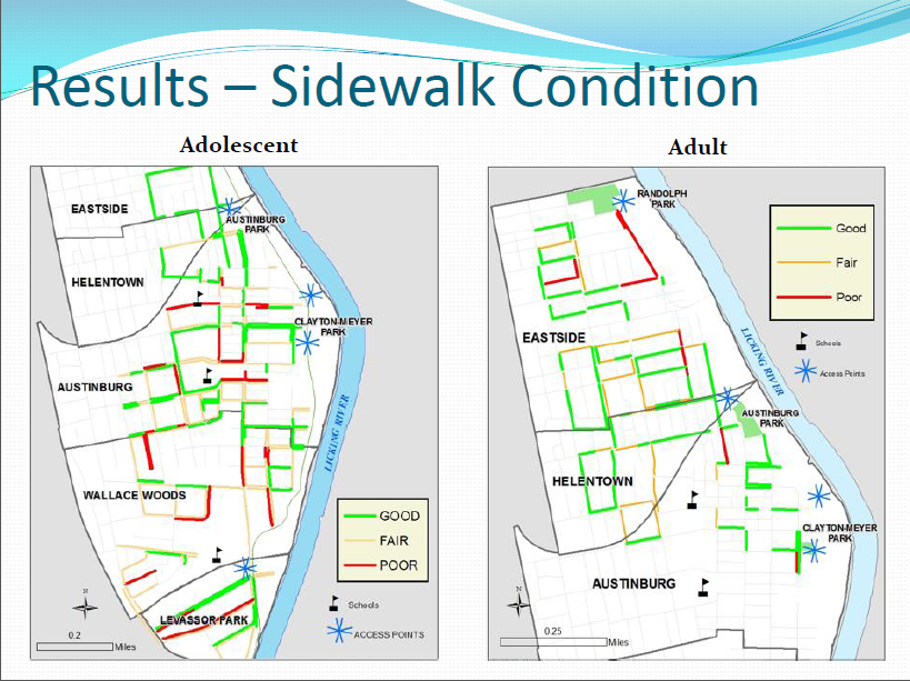
Mapped data showing sidewalk conditions in study area.

Mapped data of local residents' perceptions of traffic volume in study area.


Mapped data of local residents' perceptions of safety in study area.


Findings analyzed and mapped against poverty levels.


Lessons Learned


Michael's research identified many positives:
  • Good proximity of access points to neighborhoods and schools
  • Good presence and quality of surrounding sidewalks
There were also some areas of concern:
  • High perception of poor safety and high traffic near schools and access points
  • Barriers to access are more prominent in under-resourced neighborhoods
Targeted interventions and policy changes should consider not only the built environment, but also local perceptions of safety and traffic volume.

Michael will be presenting several upcoming HealthLandscape webinars. He'll also be glad to answer questions about his research during the webinars.

Register today to see how GIS visualization can help you see your neighborhoods in a new light.


The Community Data Portal
In-depth demonstration of our award-winning data dissemination tool
Tuesday, December 10, 2:00 pm EST
Visualizing Data with HealthLandscape
Overview of all of our data visualization tools, including the Site Performance Explorer
Tuesday, December 17, 2:00 pm ET
Introduction to HealthLandscape
In-depth instruction on using HealthLandscape, our free online mapping tool and data library
Tuesday, January 7, 2:00 pm ET

Wednesday, November 20, 2013

GIS Data Visualization: Indispensable for Policymakers and Community Leaders

The Data! Fostering Health Innovation in Kentucky and Ohio conference proved to be a showcase for GIS technology in practice.
The Data! Fostering Health Innovation in Kentucky and Ohio conference
proved to be a showcase for GIS technology in practice.
Geospatial data visualization is an indispensable tool for policymakers and community leaders, as evidenced by yesterday's Data! Fostering Health Innovation in Kentucky and Ohio conference. Although the conference was not intended to be a showcase for geospatial information system (GIS) technology, almost every presenter used geospatial data visualization and analysis to tell their story. In many cases, it was the story.

Here are three highlights from the day.


GE Aviation Uses GIS Data Visualization to Improve Employee Health


GE Aviation is using a customized version of HealthLandscape's Site Performance Explorer to bring common sense and creativity to its efforts to improve employee health. For example, GE used to spread a "Stop Smoking" message only among its workers. Now the company uses GIS data visualization to see the prevalence of smoking in the communities that surround its sites. When a visualization shows high smoking rates, GE extends its nonsmoking promotions throughout the community because the company recognizes that employees are more likely to stop smoking if their friends and family members don't smoke. GE uses their customized app to address other health issues as well, such as improving employee access to primary care providers and promoting health screenings.

Why GIS? Because GIS data visualization draws attention to factors within a community that can directly affect an organization.

The City of Louisville Tackles Asthma Using GIS Data Visualization


Ted Smith, Chief of Economic Growth and Innovation for the city of Louisville, Kentucky, is using GIS data visualization not only to improve residents' health, but also to increase the region's economic vitality.

Statistics show that Louisville has extremely poor air quality--among the worst in the nation--making it a challenging place for people with asthma to live. High asthma-related emergency room admission rates and poor air quality scores make it difficult to attract and retain businesses. Smith has initiated a program with Propeller Health to supply Louisville-area residents with GIS-equipped inhalers. Each time a patient uses their inhaler, sensors record when and where the puff was taken. Analysts then combine inhaler data with weather, air pollution, traffic pattern, and other large data sets to look for ways to intervene, on both the patient and the policy level.

There have already been some surprising findings. For example, residents generally avoid living on the city's west side, where large industrial complexes are located and pollution levels are perceived to be high. Data have shown, however, that particulate matter levels are much higher in Louisville's wealthiest neighborhoods, likely due to weather patterns and the city's topographical characteristics. GIS data visualization shows just how pronounced the difference is.

Why GIS? Because GIS data visualization can show truths that run counter to our intuition.

Ohio-Kentucky-Indiana Regional Councils of Government Uses Crowdsourcing to Map Bike Routes 


Ohio-Kentucky-Indiana Regional Councils of Government (OKI) wanted to create bike route maps for Northern Kentucky and Ohio. They tried traditional outreach methods (e.g., email, meetings) to engage the cycling community. Their most successful effort was a survey conducted at local bike shops. They received a total of 34 responses.

OKI decided to try a new approach: crowdsourcing. They created a simple online mapping platform and invited the cycling community to add bike routes to the online map. They also invited riders to share their experiences with those routes. The resulting Bike Route Guide is now a permanent part of OKI's website (click here for the link).

Why GIS? Because GIS data visualization can invite participation and community engagement in a way that traditional methods do not.

At HealthLandscape, we strive to create GIS data visualization tools that don't require GIS specialists to use them. We want you to be able to make your data accessible, "mash it up" with other data sets, and use the visualizations to ask questions and formulate solutions to your community's challenges.

To learn more about our GIS data visualizations, attend one of our free webinars.

Introduction to HealthLandscape
In-depth instruction on using HealthLandscape, our free online mapping tool and data library
Thursday, December 5, 2:00 pm ET
The Community Data Portal
In-depth demonstration of our award-winning data dissemination tool
Tuesday, December 10, 2:00 pm EST
Visualizing Data with HealthLandscape
Overview of all of our data visualization tools, including the Site Performance Explorer
Tuesday, December 17, 2:00 pm ET

Thursday, October 31, 2013

Agenda Announced for Data! Fostering Health Innovation in Kentucky and Ohio Conference


Data! Fostering Health Innovation in Kentucky and Ohio

Tuesday, November 19, 2013, 9:30 am to 4:00 pm ET

Northern Kentucky University METS Center

FREE


Have you registered yet? You can still get in, but we need your reservation by November 9.

The Data! Fostering Health Innovation in Kentucky and Ohio conference will showcase novel and effective uses of health data in the Kentucky-Ohio region. We'll welcome keynote speakers Dwayne Spradlin (CEO of the Health Data Consortium) and Damon Davis (Director of the Health Data Initiative of the U.S. Department of Health and Human Services).

The conference is organized around Thomas R. Frieden's Health Impact Pyramid. The Health Impact Pyramid is a framework that describes different types of public health interventions. Interventions at the base of the pyramid (socioeconomic factors) have potential to impact the greatest number of people; interventions at the top of the framework (counseling and education) require more work on an individual level. (Click here to read a great blog post by Jennifer Chubinski, Director of Community Research at Interact for Health, which presents readers' suggestions on how to apply the pyramid.)

Panel sessions will address three of the five tiers of the Health Impact Pyramid.

Socioeconomic Factors Panel: moderated by Ross Meyer, Vice President, Community Impact, United Way of Greater Cincinnati
  • Simplifying Data to Drive Health and Productivity Strategies: Craig Osterhues, Manager, Health Services, GE Aviation
  • UDS Mapper: Jennifer Rankin, Geospatial Informatics Senior Analyst, Robert Graham Center
  • Exploring the Facts Matter Data Portal: Eric Rademacher, Co-Director, Institute for Policy Research, University of Cincinnati
Changing the Context Panel: moderated by Gabriela Alcalde, Health Policy Director, The Foundation for a Healthy Kentucky
  • Mapping Louisville's Urban Trees: Collecting Baseline Data for a Healthier Community: Pat Smith, Community Planner and Evaluation Researcher with REACH Evaluation and Director, City Collaborative
  • Food Deserts in Hamilton County: Chris Auffrey, Associate Professor, School of Planning, University of Cincinnati
  • Exploring Access to Walking and Biking Trails Using Sidewalk Audits and Participatory Mapping: Michael Topmiller, Doctoral Candidate, Department of Geography, University of Cincinnati and GIS Data Specialist, HealthLandscape, LLC
  • The Cincinnati Bike Flash Map Campaign: Using a Crowd Source Strategy to Map Bike Routes in Cincinnati: Gayle Foster, Project Administrator, Ohio-Kentucky-Indiana Regional Council of Governments
Long-Lasting Protective and Clinical Interventions: moderated by Karen Bankston, Associate Dean of Clinical Practice, Partnership, and Community Engagement, University of Cincinnati College of Nursing
  • Louisville Asthmapolis Project, Civic Health Data: Citizen as Sensors: Ted Smith, Chief of Economic Growth and Innovation, Louisville Metro Government
  • M2M Online Delivery: Healthcare's Next Megatrend: Chuck Thornbury, Founder, meVisit Technologies
  • Overview of the Health Benefit Exchange, KyNect: Carrie Banahan, Executive Director, and Bill Nold, Deputy Executive Director, Kentucky Office of the Health Benefit Exchange
And we'll announce the winner of our infographic competition!

We invite your participation on November 19. Lunch is provided, and you'll have an opportunity for roundtable discussions with the panelists.

Only a few spots remain, so register today!


Please note: The conference is co-sponsored by HealthLandscape, Interact for Health, and the Foundation for a Healthy Kentucky. Registration is free, but we must assess a $75 cancellation charge for any guest who cancels after November 9.

Monday, October 28, 2013

When Do I Use QuickThemes? When Do I Use QuickGeocodes?


Have you ever tried plugging your own data into HealthLandscape and not gotten the results you expected? This happened to one of our users recently. After a quick phone call, we realized we needed to offer some clarification on using QuickThemes and QuickGeocodes.

QuickThemes and QuickGeocodes are two of HealthLandscape's most powerful and popular tools. Both tools:
  • Enable you to upload your own data and create your own maps.
  • Require no GIS expertise to use them.
  • Are free for small data sets. Simply log in to www.HealthLandscape.org to get started and select either QuickThemes or QuickGeocodes from the Tools menu.
There is one major difference between the two tools:
  • QuickThemes requires aggregate data.
  • QuickGeocodes requires address (a.k.a. point-level) data.
This is important, because if you upload the wrong kind of data into the tool, the tool will not work.

Aggregate data "rolls up" individual pieces of data into one collection--a summary, if you will. You see information that applies to a geographical area (sometimes called a geography) rather than to individuals within the geography. It's impossible to garner person- or site-specific information from aggregate data.

Address data (a.k.a. point-level data) is very specific. In GIS terms, it can be displayed as a single point on a map. The point could represent the address of a school, the address of a farmer's market, or even the address of a specific person. Because of that specific address, anyone who views the map can figure out a lot about that person or site. You have to be careful about how you use point-level data. You don't want to inadvertently invade someone's privacy or misuse their data.

Here's a scenario that might further clarify the difference. Perhaps you work for a community health agency that provides on-site clinic care, but also offers in-home support to selected patients. You have a spreadsheet that contains the addresses for every patient you have served over the past year. When would it make sense to use QuickThemes, and when would it be better to use QuickGeocodes?

You might use QuickThemes when you want to see which Zip codes or counties most of your clients come from, or if you're trying to figure out where to locate a new clinic site. Take the spreadsheet, total the number of patients from each county, and map those totals against the corresponding county. You could also tally other demographic information, such as race, insurance status, employment status, or other data variables you collect.

The map might look something like this:

QuickThemes maps aggregate data
Map created using HealthLandscape's QuickThemes tool.
QuickThemes creates maps of aggregate data.
You might use QuickGeocodes when you are trying to understand where patients with asthma or diabetes are located. You could display those addresses on a map, and send a diabetes educator to visit homes of patients' whose glucose levels exceed a certain threshold.
The map might look something like this:

QuickGeocodes maps point-level data
Map created using HealthLandscape's QuickGeocodes tool.
QuickGeocodes creates maps of point-level data.


Twice a month, we offer free "Introduction to HealthLandscape" webinars to help you use HealthLandscape effectively in your context. All of our webinars are live, so they are perfect opportunities to get clarification and ask questions.

Register today!


Introduction to HealthLandscape
In-depth instruction on using HealthLandscape, our free online mapping tool and data library
Tuesday, October 29, 2:00 pm ET
The Community Data Portal
In-depth demonstration of our award-winning data dissemination tool
Thursday, November 7, 2:00 pm EST
Visualizing Data with HealthLandscape
Overview of all of our data visualization tools, including the Site Performance Explorer
Wednesday, November 20, 2:00 pm ET