
Thursday, February 7, 2019

The Rural Health Explorer

We’ve all seen the meme - a beautifully rustic cabin and the question, “Would you live here if you had to give up [insert something here]?” Sometimes it’s the internet, sometimes it’s football, but the truth is, people living in rural areas face the real possibility of doing without more than WIFI and professional sports. Research shows that rural Americans often have lower access to health care providers and facilities, as well as fewer educational opportunities, fewer food options, and decreasing job availability.

To help health care providers, policy makers, researchers, and other stakeholders better understand the potential needs of rural communities, HealthLandscape created the Rural Health Explorer.

The HealthLandscape Rural Health Explorer includes the Rural Population Health Mapper, Appalachia Community Data Portal, and Rural Health Workforce Mapper (all described below). The Explorer also includes other mapping tools focused on health behaviors, health outcomes, and healthy living assets in non-urban counties across the U.S., as well as the entire Appalachian region.  

Rural Population Health Mapper

The Rural Population Health Mapper draws from the RWJ County Health Rankings data to let users explore behaviors and health care resources that impact health outcomes, as well as policies and program initiatives that can impact these measures. Results are for ONLY non-metro counties, as classified by the USDA ERS Rural-Urban Continuum Codes.

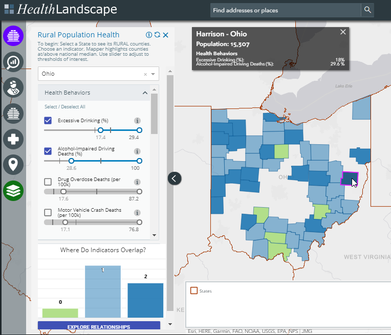
In the example below, we’ve selected the State of Ohio, and focused on percent of adults reporting Excessive Drinking and the percent of Alcohol-Impaired Driving Deaths. The slider controls for Excessive Drinking are set to the national median (17.4%) and the national maximum (29.4%). The two vertical marks on the slider show you the range of Excessive Drinking for Ohio counties. The user can adjust the slider to meet their needs.

By turning on two or more indicators (two, in this example), you can see the overlap or areas where counties meet both conditions. For example, we highlight Harrison County in eastern Ohio, with an Excessive Drinking rate (18%) AND percent of Alcohol-Impaired Driving Deaths (29.6%) above the national medians.


Appalachia Community Data Portal

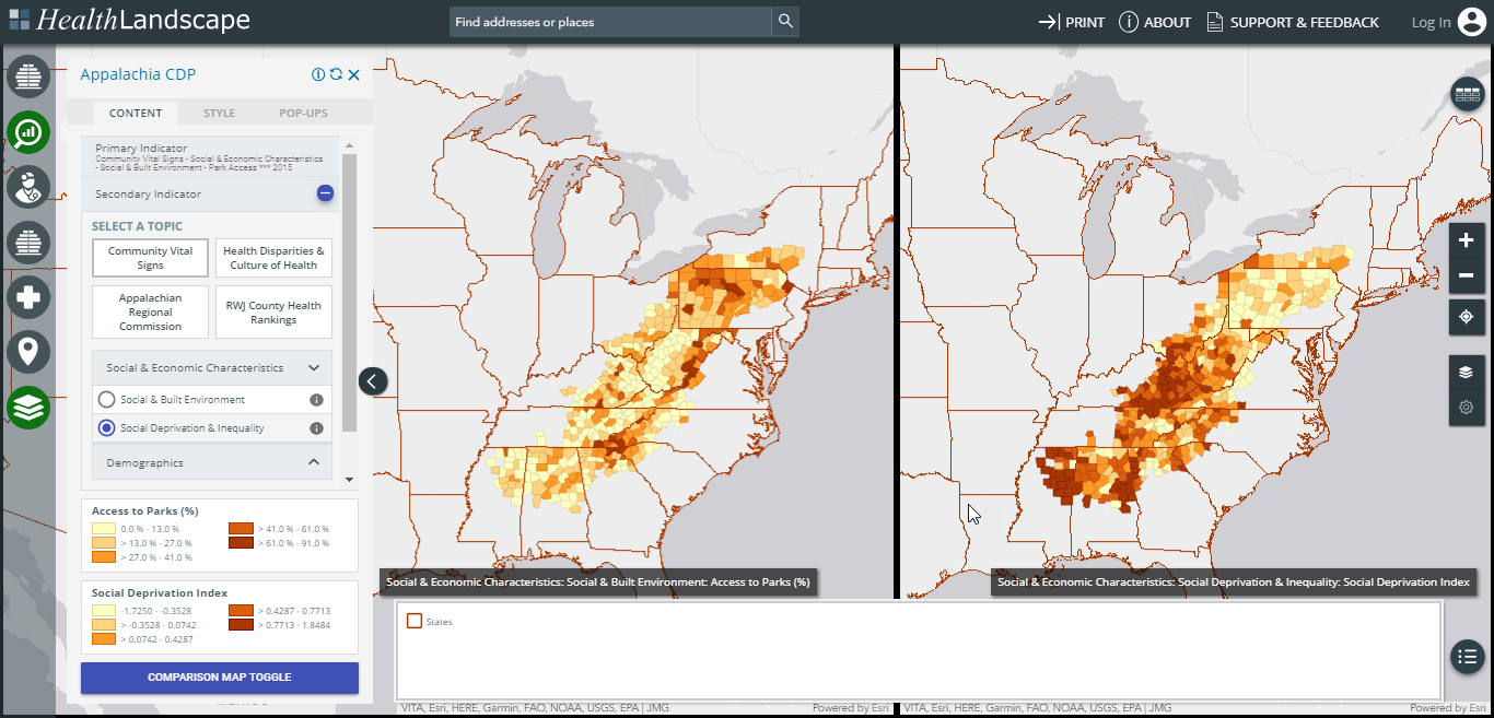
The Appalachia Community Data Portal focuses on the 420 counties in the 13-state Appalachian region that stretches from New York to Mississippi. It includes all of West Virginia and parts of Alabama, Georgia, Kentucky, Maryland, Mississippi, New York, North Carolina, Ohio, Pennsylvania, South Carolina, Tennessee, and Virginia. The Appalachia Community Data Portal combines county-level data from multiple sources, including economic status and health disparities data from the Appalachian Regional Commission (ARC); health outcomes, behaviors, and clinical care data from the Robert Wood Johnson County Health Rankings; and demographic and social determinants of health data from HealthLandscape’s Community Vital Signs data library.


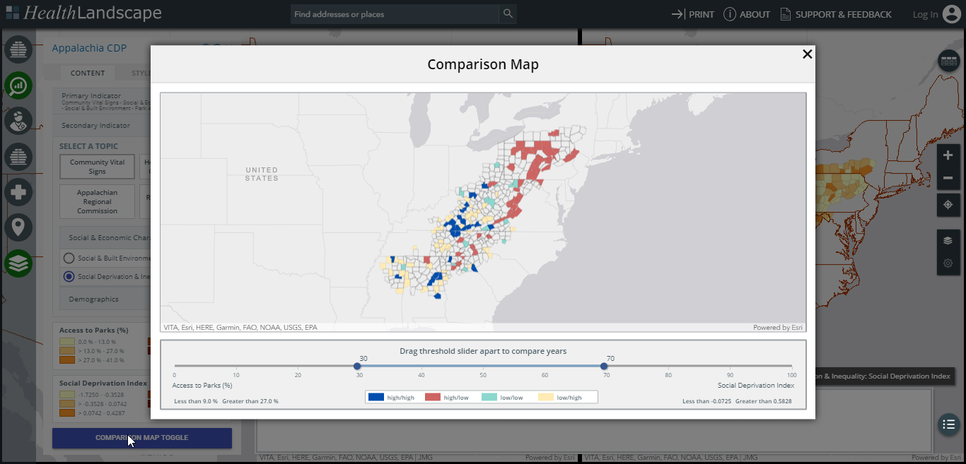
In the examples below, we use the Appalachia Community Data Portal comparison mode to explore a side-by-side map, and a combined map, of Access to Parks and the Robert Graham Center Social Deprivation Index.


Rural Health Workforce Mapper

The Rural Health Workforce Mapper includes all rural AND urban counties, while focusing on targeted physician and non-physician specialties that are important members of the rural health care continuum.
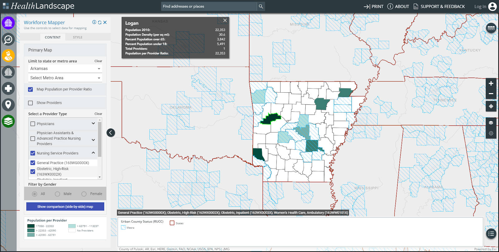


In the example above, we are mapping the number of nursing service providers by county in Arkansas and highlighting Logan County, which has one provider and a population to provider ratio of 22,353:1. The map also highlights the number of non-metro counties that do not have any nursing service providers.

Interested in learning more? Attend one of our free, upcoming webinars. We'll demonstrate the tools within the Rural Health Explorer and answer any questions you may have. Register for this and other HealthLandscape webinars on our website.

If you're ready to get started now, be sure to download our Rural Health Explorer Quick Start Guide. This guide will help you navigate the Explorer and its various tools. If you have questions, contact us anytime.

Monday, October 1, 2018

It’s Homecoming Season!

It’s Homecoming Season!


This past weekend was my daughter’s homecoming dance at her high school.  I took this picture before the dance, with the sun going down and students just beginning to arrive.  They couldn’t ask for a better start to the evening.

I have to admit that I’ve never taken part in my own high school’s homecoming activities as an alumni, which says more about me than anything about my alma mater.

This did get me thinking, though.  How many of the folks I work with have gone to their old schools for Homecoming?  Why haven’t they?  Do they live too far away to attend?  I’ve never lived any more than 20 minutes from Edgewood High School (and the Wehr Road Hatchet Man), so I have no real excuse.  But what about other folks on the HealthLandscape team?  I know someone in DC is from Texas, and another in Seattle is from New Jersey.  Is my geographically rooted existence the norm?  Or am I an outlier?

And faster than you can say “Curiouser and curiouser!”, I’m heading down a rabbit hole of place of birth and migration data.  What can I learn and how can I visualize this with GIS?


The first I did was visit the American Fact Finder web site and download Place of Birth data for all 88 counties in Ohio.  For these maps I wanted to have as much detail as possible, including more rural areas of Ohio, so I used the five-year aggregate file rather than the 1-year file.

It looks like about 70 percent of residents of Butler County, Ohio are native to Ohio (not necessarily same county, but I’ll not hold that against them).  And just perusing the Percent Natives Born in Ohio column, it looks like my home county has a fair number of transplants.


I logged into HealthLandscape and used the Map My Data tool to upload and create a thematic map of that information for all counties in Ohio.    Lots of interesting information here.  Butler County (highlighted in red) is sort of in the middle of the pack when it comes to out-of-state immigration.  It’s also interesting to see the difference between central ohio -- driven by Columbus and Ohio State University, south eastern border counties -- with apparent inter-state migration from bordering West Virginia and Kentucky, and the area between the two -- predominantly Ohio’s Appalachian region.


So, what did I learn?  My home town (or at least my county) isn’t nearly as ‘rooted’ as I once thought.  Am I an outlier?  It’s not clear, and I’ll need to do a little more digging and exploration using Map My Data and exploring HealthLandscape’s Community HealthView library of data. Next time.

Mark Carrozza
Director, HealthLandscape

Join us for an upcoming webinar to learn more about
how HealthLandscape mapping tools can help explore your world
http://www.healthlandscape.org/webinar-training.cfm


Friday, August 25, 2017

Community HealthView Update Brief #43: Bureau of Economic Analysis (BEA)

During the week of August 23rd, 2017, HealthLandscape updated Community HealthView with seven datasets from The Commonwealth Fund and the Bureau of Economic Analysis (BEA). The first dataset, from The Commonwealth Fund, details the 2017 state health system performance rankings. The State Scorecard is an attempt by The Commonwealth Fund to cover a set of indicators that span all core dimensions of health system performance - including healthy lives, access, quality, efficiency and equity - in one comprehensive report. This assessment endeavors to spur public policymakers and private stakeholders to improve health system performance at the state level, and to offer a metric for evaluating state health system performance. Six datasets from BEA’s Regional Economic Accounts were uploaded for data years 2014-2015 and 2012-2015, depending on data gaps in Community HealthView. These data covered topics such as gross flow of earnings, non-farm income, personal income, and unemployment insurance compensation. The BEA regional economic accounts provide statistics about Gross Domestic Product (GDP) for states and metropolitan areas and Personal Income for states, counties, metropolitan areas, micropolitan areas, metropolitan divisions and combined statistical areas, and BEA economic areas.

Dave Grolling
GIS Strategist, HealthLandscape

The Community HealthView Tool can be accessed via several HealthLandscape tools that can be found at https://www.healthlandscape.org/live-Applications.cfm

Wednesday, August 16, 2017

Using GIS to Compare Areas of Economic, Health, and Social Risk in Appalachia

A recent article in Health Affairs points to widening health disparities between Appalachia and the remainder of the United States. Singh et al. find that disparities in both life expectancy and infant mortality have increased over the last decade and can be attributed to several factors, including higher rates of chronic disease, unintentional injuries, and drug overdoses.


While it’s important to highlight the disparities between Appalachia and the rest of the U.S., we shouldn’t lose sight of the major disparities that also exist within the Appalachia region. Central and southern Appalachia generally have higher rates of poverty and worse health outcomes than other parts of Appalachia. As shown in the map below, higher rates (in darkest blue) of age-adjusted mortality are concentrated in central Appalachia, particularly in eastern Kentucky and southern West Virginia. McDowell County, WV has mortality rates almost 400 percent higher than Union County, PA. Similar patterns exist for a number of other health outcomes, economic indicators, and social determinants.


ApBlog12017-08-15_1620.png


The map below shows the distribution of Economic Status according to the Appalachian Regional Commission, where counties are categorized as Distressed, At-Risk, Transitional, Competitive, and Attainment based on factors such as poverty, income, and unemployment.  The majority of the Distressed and At-Risk counties are concentrated in central and southern Appalachia.


ApBlog2-2017-08-15_1621.png


In order to explore the relationship between poverty and mortality, we combined the two indicators by quartiles – showing the counties in the highest quartile for both poverty and mortality in blue, and the counties in the lowest quartile for both poverty and mortality in yellow. Similar to the patterns above, blue counties are concentrated in central and southern Appalachia.
ApBlog3-2017-08-15_1621.png
The Health Affairs article addresses the disparities between Appalachia and the rest of the U.S.  However, it is important to also be aware of the disparities within the Appalachia region, where focusing on the highest need counties is likely to have the largest impact.


All the maps above were created using the Appalachia Data Portal, one of several HealthLandscape mapping tools that are in the process of being updated. For more information about the Appalachia Data Portal, see our previous post that focused on the impact of hospital readmission penalties on safety-net hospitals in Appalachia - http://healthlandscape.blogspot.com/2015/09/hospitals-located-in-distressed.html.


Michael Topmiller, PhD

Health GIS Research Specialist

Friday, August 4, 2017

Community HealthView Update Brief #40: AIDS Prevalence and CMS Costs Data

During the week of August 3rd, 2017, HealthLandscape updated Community HealthView with nineteen datasets from the Appalachian Regional Commission, AIDSVu, and Centers for Medicare and Medicaid (CMS) Administrative Claims Data.

The data from the Appalachian Regional Commission included economic data for only those counties in the Appalachia region.

The data from AIDSVu on AIDS prevalence were also added for rates by age, race, sex, and county for 2013. The HIV prevalence and new HIV diagnoses data presented on AIDSVu are collected by state and local health departments, and de-duplicated and processed by the U.S. Centers for Disease Control and Prevention (CDC) to meet data quality standards for comparability and reliability. The data reflect persons living with diagnosed HIV infection or persons living with diagnosed HIV infection.

The remaining fourteen datasets all came from the latest CMS geographic variation file. For data year 2015, these data include costs information for ambulatory surgery centers, durable medical equipment, skilled nursing facilities, hospice, imaging, Federally Qualified Health Centers (FQHC), and long term care hospital costs, among others. CMS has developed these data that enable researchers and policymakers to evaluate geographic variation in the utilization and quality of health care services for the Medicare fee-for-service population.

Access the Community HealthView tool in any of our tools including:
Social Determinants of Health Mapper: https://www.healthlandscape.org/map_SDOH.cfm
The UDS Mapper: https://ww.udsmapper.org

“How to” on Community HealthView in the UDS Mapper via this link: https://www.udsmapper.org/docs/HowtoUsetheCommunityHealthViewToolintheUDSMapper.pdf

Tuesday, August 1, 2017

ACA Uninsurance Rates and Potential ACHA Effects

During the week of July 10th to the 14th, 2017, HealthLandscape attended the annual Esri User Conference in San Diego. Part of the conference was designated to showcasing attendee’s various cartographic products in a map gallery. HealthLandscape submitted two products to this year’s Map Gallery, a small format map depicting the mosquito season in the United States in relation to the Zika outbreak, and an Esri Story Map showing a pre- and post-Affordable Care Act (ACA) comparison of uninsurance rates for the United States.  A story map is an online map that allows a map maker to combine narrative text, images, and video clips into a map, to tell a story. 


This Map Gallery submission focused on uninsurance rates before and after the ACA went into effect on January 1st, 2014. From this date forward it has been a requirement for U.S. Citizens to have health coverage without incurring a penalty. The ACA was enacted to provide cheaper health insurance, expand Medicaid, and support innovative medical care delivery methods. This map shows the county rates of the population who were uninsured in 2013 (left), compared with the same map on the right of the swipe bar, using 2015 rates. This shows the drastic decrease in uninsurance rates as gains were made in Medicaid and Health Insurance Marketplace coverage around this time. Most of the areas in the 2015 map that show the least amount of change since 2013- like Florida, Texas, Missouri, or Alabama- are states that chose not to adopt Medicaid coverage. States like California that did adopt the expansion have decreased their overall rates of uninsured. The example shown in the map is for Los Angeles County, California, where the uninsurance rate dropped from 23.7% in 2013 to 12.5% in 2015, a difference of a million people.

Even though the recent attempts to repeal the ACA have failed for now, there is still a desire to repeal or alter the ACA.  The House proposal would eliminate health coverage for 14 million Americans in 2018 and then an additional 23 million by 2023.1 Under this proposal, called the American Health Care Act (ACHA), states like California, that saw a decrease in uninsurance by one million, is projected to have total coverage losses of upwards of 2.5 million people, through Medicaid, employer-sponsored insurance, and private insurance.1 The map shown below was created using data reported by the Center for American Progress and with estimates from the Congressional Business Office (CBO), and shows a state-by-state breakdown of the number of nonelderly Americans projected to lose health coverage under the ACHA.


1. Gee, E. “CBO-Derived Coverage Losses by State and Congressional District”.  Center for               American Progress. May 25th, 2017. 

Dave Grolling
GIS Strategist
HealthLandscape  


Monday, July 31, 2017

HealthLandscape Releases 5th Geospatial Brief

Today, HealthLandscape is releasing our fifth Geospatial Brief, “Where are Areas in Greatest Need of New HealthCenters? A Spatial Empirical Bayes Approach.” [MT1] Brief #5 uses 2015 data from the UDS Mapper (www.udsmapper.org) to explore areas with high rates and numbers of low-income population that are not being served by the Health Center Program. Specifically, we use a spatial empirical Bayes approach to create smoothed rates for low-income penetration and weighted estimates for the number of low-income population not being served by a health center. This blog discusses the importance of identifying priority areas of need and provides more details about our approach.

Prioritizing areas in highest need of safety-net health services and allocating resources in the most efficient way possible will be increasingly important in the current political context. The American Health Care Act (AHCA) and the Better Care Reconciliation Act (BRCA) drastically reduce funding for Medicaid, while the president’s proposed budget slashes funding for the Food and Drug Administration (FDA), the Centers for Disease Control (CDC), and National Institutes of Health (NIH). Despite the growing opioid epidemic, even the Substance Abuse and Mental Health Services Administration (SAMHSA) budget is the target of proposed cuts (Jost, 2017). While the funding for the federally-funded Health Center Program (HCP) appears to be steady, the funding cuts in these other areas have the potential to be particularly impactful on the HCP, which relies on the federal government and Medicaid as important revenue sources (Han et al., 2017).

Health Centers (HCs) that are part of the HCP are a vital part of the health care safety net. Established more than 50 years ago to provide primary medical, dental and behavioral care, the approximately 1,400 HCs operate more than 9,800 clinic sites to meet the needs of the medically underserved population in the US. The HCP serves roughly 25 million high-need people annually. Research has shown that HCs have a positive impact in terms of improved access to care, reduced avoidable hospitalizations, and better health outcomes (e.g., Evans, et al., 2015). The Health Resources and Services Administration (HRSA) and Bureau of Primary Health Care (BPHC) fund new sites based on need within a community, established by the applicant based on service-area based statistics.

In general, identifying priority areas of need presents several challenges. First, one could choose from a number of different ways to define need. Is poverty a sufficient measure to define need?  What about a composite measure of social deprivation?  These are questions that are still being sorted out.  In the context of the HCP, using low-income penetration or poverty rates will assure you prioritize areas with highest rates of need, but doesn’t consider the number of people in need. This issue could be dealt with by using the number of low-income people that are not served; however, this would lead to only densely populated urban areas being identified as areas in need, and would exclude rural and isolated areas.

There is also the matter of attempting to define the geography in need, which comes back to the age-old modifiable areal unit problem (MAUP). Should neighborhoods be used as the unit of analysis?  If so, is it appropriate to define neighborhoods based on census tracts? In the health center world, ZIP Code tabulation areas (ZCTAs) are typically used because of data availability (and that is how data are reported in the UDS Mapper), but need may exist within particular parts of a ZCTA or be spread across parts of multiple ZCTAs.

To address the issues above, we used a spatial empirical Bayes approach to identify high-need ZCTAs. In general, empirical Bayesian approaches help deal with the instability in population over large areas by adjusting or smoothing rates based on population size toward the overall mean. For example, using a Bayesian approach to estimate low-income penetration rates would adjust ZCTAs with small low-income populations more towards the overall mean, while high low-income population ZCTAs would be adjusted less.

While using a standard empirical Bayesian approach would help smooth out ZCTAs with very small populations, the approach does not account for regional variations, and would likely over-adjust small, isolated rural areas with high need. For these reasons, we used a spatial (also called local) empirical Bayes approach to estimate low-income penetration rates. The spatial empirical Bayes approach still adjusts the rates based on the size of the low-income population, but instead of adjusting based on the overall mean, it adjusts the rates for ZCTAs based on a local mean, which is the average rate of each ZCTA and its contiguous neighbors.
 
We defined high-need ZCTAs as those with a smoothed penetration rate of less than one percent and ranked them based on a weighted estimate of low-income population not served by health centers. The weighted unserved low-income estimate was calculated by taking the average number unserved for each ZCTA and its contiguous neighbors. The geospatial brief focuses on the top 500 ZCTAs in need based on our criteria; we chose 500 because between 400 and 700 new HCs have been funded annually over the past seven years.

Again, it is important to note that our approach for defining high-need areas for the HCP is just one of many possibilities. It is not intended to be used as a rule for funding allocations for the HCP, but only as a starting point to help overcome the challenges of identifying areas most in need. The primary objective of the geospatial brief is to highlight the potential of geospatial and Bayesian methods for overcoming these challenges to identify priority areas.

References

Evans, Christopher S., Sunny Smith, Leslie Kobayashi, and David C. Chang. (2015). The Effect of Community Health Center (CHC) Density on Preventable Hospital Admissions in Medicaid and Uninsured Patients. Journal of Health Care for the Poor and Underserved 26(3): 839-851.

Han, Xinxin, Qian Luo, & Leighton Ku. 2017. Medicaid Expansion and Grant Funding Increases Helped Improve Community Health Center Capacity. Health Affairs 36(1): 49-56.

Jost, Timothy. “Trump Budget Proposes Big Health Cuts.” May 23, 2017. Health Affairs Blog
Available at http://healthaffairs.org/blog/2017/05/23/trump-budget-proposes-big-health-cuts/


 [MT1]Link to Brief