The Health Foundation of Greater Cincinnati (one of HealthLandscape's sponsoring organizations) and The Foundation for a Healthy Kentucky recently co-sponsored an event called "The Hot Spotter's Agenda: Targeting Resources to Achieve Quality Care." Keynote speaker was Dr. Jeffrey Brenner, a primary care physician in Camden, New Jersey.
Dr. Brenner's dramatic story is told in a 2011 New Yorker article by Atul Gawande. Dr. Brenner, who was on track to become a neuroscientist, instead changed his vocational focus after volunteering one day a week in a free primary care clinic during medical school. After seeing how patients were treated--or not, in one case--he became curious about the relationship between crime "hot spots" and health care delivery. He used maps to plot the data. Although he did not persuade city leaders to implement solutions based on his findings, he continued to collect and examine data and look for medical usage patterns using maps.
He made many discoveries. For example, he located the two blocks that accounted for more healthcare costs than any other in the city--totaling more than $200 million in healthcare bills in a 5.5-year period. He found that a single building sent more people to hospitals as a result of serious falls than any other, totaling almost $3 million in healthcare costs.
Dr. Brenner made meaningful use of the data. He has subsequently poured his efforts into the Camden Coalition of Healthcare Providers, an organization he founded to treat "superutilizers." His team has successfully built relationships with the patients they serve, and the Coalition's care has resulted in significant reductions in healthcare costs.
Click here to view Dr. Brenner's keynote entitled, "Bending the Cost Curve and Improving Quality in One of America's Poorest Cities." Also presenting are Greg Moody and Eric Friedlander, who give Ohio and Kentucky regional perspectives to the concept of "hot spotting."

Monday, April 16, 2012

Tuesday, April 10, 2012
Using Pinterest and HealthLandscape as a Way to Share Your Community Data
Have a Pinterest account? HealthLandscape does too. We just set ours up a week or so ago, so we can begin to showcase some of our tools and current projects. (Look for it to build out over time.)
Pinterest has taken hold because it harnesses the power of visual communication. Any image can be pinned—a photo, ad, infographic, data visualization, or video—and it will grab your viewer's attention quicker than words alone would.
So have you thought about using Pinterest as a way to share your mapped data? Your map + Pinterest could equal more traffic to your web site and more of your data getting out into the community!
Simply follow these steps:

Pinterest has taken hold because it harnesses the power of visual communication. Any image can be pinned—a photo, ad, infographic, data visualization, or video—and it will grab your viewer's attention quicker than words alone would.
So have you thought about using Pinterest as a way to share your mapped data? Your map + Pinterest could equal more traffic to your web site and more of your data getting out into the community!
Simply follow these steps:
- Develop your map in HealthLandscape using our QuickGeocodes, QuickThemes, or Community HealthView tool.
- Save the file.
- Upload the finished file to your organization's Pinterest site.
- Be sure to add a description of the map and some creative copy that links to your organization's web site.
- Anticipate referral traffic!

Monday, April 2, 2012
"Obesity and Food Insecurity" Published in Appalachian Health and Well-Being

Their chapter examines the linkages between food scarcity and obesity in Appalachian rural and urban areas and, in particular, the Cincinnati area. Jennifer and Mark present the data as well as their recommendations for policy solutions and further research.
Appalachian Health and Well-Being is edited by Robert L. Ludke, Ph.D., a professor in University of Cincinnati's Department of Family and Community Medicine, and Phillip J. Obermiller, Ph.D., a senior visiting scholar in the School of Planning within University of Cincinnati's College of Design, Architecture, Art, and Planning (DAAP), and a fellow at the Appalachian Center, University of Kentucky. It is published by the University Press of Kentucky, and is available now from amazon.com in both hardcover and Kindle format.
Thursday, March 29, 2012
Infographic or Data Visualization?
What's the difference between an infographic and a data visualization? Robert Kosara, Associate Professor of Computer Science at UNC Charlotte, explains it well on his blog. He says, "The visualization is created by a tool that can be applied to many datasets, the infographic is hand-crafted for a particular dataset."
We'd like to help you visualize your data. Contact us at info@healthlandscape.org.
Sidenote: Be sure to read the comments on Robert's post. His ZIPScribble maps are pretty cool too.
HealthLandscape creates data visualizations
With HealthLandscape, you can:- Use the tools again and again for multiple data sets.
- Update your custom map at any time with more current data.
- Interact with your data to better understand it.
- View your data at multiple levels: state, county, census tract, or census block group.
- Add our data layers to your data.
We'd like to help you visualize your data. Contact us at info@healthlandscape.org.
Sidenote: Be sure to read the comments on Robert's post. His ZIPScribble maps are pretty cool too.
Monday, March 26, 2012
Open Government, Accessible Data: Let Your Voice Be Heard!
Making data open and accessible is a core value at HealthLandscape. We believe you should have full access to public data, in usable form.
Implementation of the Obama administration's 2009 Open Government Directive—which encourages transparency, collaboration, and participation by increasing access to government information—is now underway. The Department of Health and Human Services is inviting individuals to contribute their ideas to HHS's next Open Government Plan via an online survey: http://wcdapps.hhs.gov/OpenGovPublicInput/Survey.
Take advantage of this opportunity to let your voice be heard. Better hurry, though—deadline is April 9.
Implementation of the Obama administration's 2009 Open Government Directive—which encourages transparency, collaboration, and participation by increasing access to government information—is now underway. The Department of Health and Human Services is inviting individuals to contribute their ideas to HHS's next Open Government Plan via an online survey: http://wcdapps.hhs.gov/OpenGovPublicInput/Survey.
Take advantage of this opportunity to let your voice be heard. Better hurry, though—deadline is April 9.
Tuesday, March 20, 2012
Hamilton County Public Health Launches the Community AHEAD Data Portal
Hamilton County Public Health, a public health department that serves more than 460,000 residents in the Greater Cincinnati area, recently partnered with HealthLandscape to create a data portal called Community AHEAD (Community Access to Hamilton County Epidemiology & Assessment Data).
Community AHEAD is a web-based, interactive tool that makes public health data accessible to Greater Cincinnati residents and community leaders. It presents a complete picture of community health at the neighborhood level using maps, charts, graphs, and tables.
Community leaders access the data portal to identify and prioritize specific patient populations. Hamilton County Public Health staff epidemiologists maintain and update the data portal regularly, which ensures that the data is current and continually relevant to the communities that Hamilton County Public Health serves.
Community AHEAD grew out of a collaboration between local hospital systems and Hamilton County Public Health. Hospitals, which are required to complete a community health assessment every three years, provided public health information to Hamilton County Public Health, which stored and collected the data. Hamilton County Public Health then worked with our subject matter experts Mark Carrozza and Jené Grandmont to develop Community AHEAD as a means to share the collated data with the reporting hospitals and the community.
HealthLandscape has developed data portals for other agencies, including the Kentucky Primary Care Association. Additional data portals are currently in development. We build the portals on the HealthLandscape platform, which enables us to incorporate the power of geographic information systems (GIS) into each portal.
Contact us at info@healthlandscape to inquire about our data portal development services or call 513.322.5141.
Community AHEAD is a web-based, interactive tool that makes public health data accessible to Greater Cincinnati residents and community leaders. It presents a complete picture of community health at the neighborhood level using maps, charts, graphs, and tables.
 |
| Community AHEAD's map view showing neighborhood-level public health data on injuries due to falling. |
Community leaders access the data portal to identify and prioritize specific patient populations. Hamilton County Public Health staff epidemiologists maintain and update the data portal regularly, which ensures that the data is current and continually relevant to the communities that Hamilton County Public Health serves.
Community AHEAD grew out of a collaboration between local hospital systems and Hamilton County Public Health. Hospitals, which are required to complete a community health assessment every three years, provided public health information to Hamilton County Public Health, which stored and collected the data. Hamilton County Public Health then worked with our subject matter experts Mark Carrozza and Jené Grandmont to develop Community AHEAD as a means to share the collated data with the reporting hospitals and the community.
HealthLandscape has developed data portals for other agencies, including the Kentucky Primary Care Association. Additional data portals are currently in development. We build the portals on the HealthLandscape platform, which enables us to incorporate the power of geographic information systems (GIS) into each portal.
Contact us at info@healthlandscape to inquire about our data portal development services or call 513.322.5141.
Tuesday, February 7, 2012
HealthLandscape Tools - QuickMaps
The newest version of HealthLandscape includes a feature called QuickMaps. QuickMaps is a tool that we've developed to help our users quickly and easily create maps of their communities.
QuickMaps includes a collection of frequently-requested indicators with state, county, tract, and blockgroup (where available) level data. The QuickMaps module is turned on by default when you login to HealthLandscape, but it is also accessible in the tools menu.
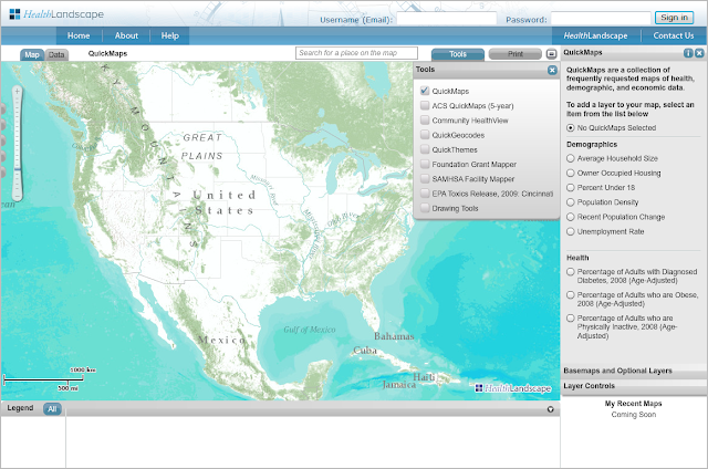
As you zoom in to smaller geographic areas, the map view will change from showing data at the state level...
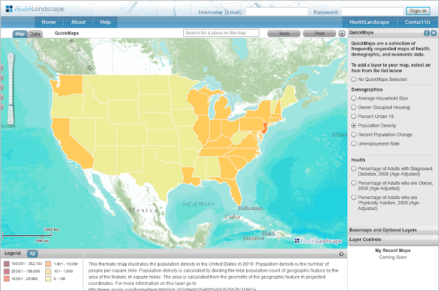
...to showing data at the county level...
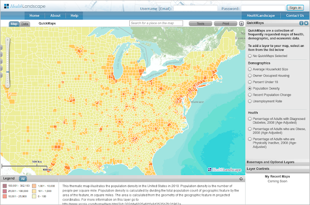
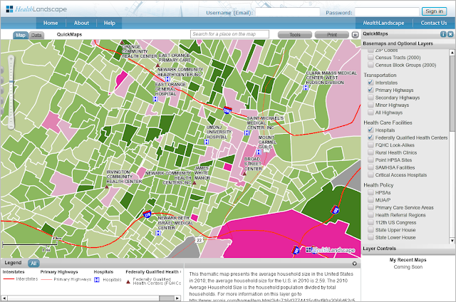
...to showing data at the census tract level and beyond, where available.
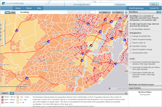
Basic Map Layers, including hospitals, health centers, geographic boundaries, and other features, can be added on top of the QuickMap selection to create more detailed maps.
Looking for data not currently featured in QuickMaps? Check out the American Community Survey (ACS) QuickMaps and Community HealthView. We will be detailing those tools in future blog posts!
QuickMaps includes a collection of frequently-requested indicators with state, county, tract, and blockgroup (where available) level data. The QuickMaps module is turned on by default when you login to HealthLandscape, but it is also accessible in the tools menu.
As you zoom in to smaller geographic areas, the map view will change from showing data at the state level...
...to showing data at the county level...
...to showing data at the census tract level and beyond, where available.
Basic Map Layers, including hospitals, health centers, geographic boundaries, and other features, can be added on top of the QuickMap selection to create more detailed maps.
Looking for data not currently featured in QuickMaps? Check out the American Community Survey (ACS) QuickMaps and Community HealthView. We will be detailing those tools in future blog posts!
Subscribe to:
Posts (Atom)